Top Data Visualization Examples and Dashboard Designs
Data visualization and dashboard design is both an art and a science. The correct use of dashboard UX and graphical excellence principles turn ordinary graphics into extraordinary experiences.

Data visualization and dashboard design is both an art and a science. The correct use of dashboard UX and graphical excellence principles turn ordinary graphics into extraordinary experiences.

Shane Ketterman
Shane comes from a background in architecture, information technology, customer experience, and UX design.
Expertise
Data visualization and dashboard design are both art and science and not as easy to create as they may first appear. How do top UX designers and visual designers illustrate complex information without confusing users?
Three ways: a better understanding of the UX principles behind good dashboard design, the application of graphical excellence, and practice.
UX dashboard design follows specific principles and best practices. Graphical excellence, on the other hand, requires a more thorough examination.
Graphical excellence is defined as:
- A well-designed and efficient presentation of interesting data.
- Complex ideas communicated with efficiency, clarity, and precision.
- Giving the viewer the highest number of ideas requiring the least amount of time within a small space and using the least amount of ink.
- Telling the truth about the data.
An excellent resource for a better understanding of graphical excellence is Edward Tufte’s work. He is considered “The Leonardo da Vinci of data” and has a large number of published works, books, and lectures. David McCandless, who founded information is beautiful, a website which represents the best in data visualizations and graphical excellence, is another excellent resource.
The principles of exemplary UX design and graphical excellence apply to both dashboard design and data visualizations. Here are some of the top data visualization and dashboard examples.
Top Data Visualizations
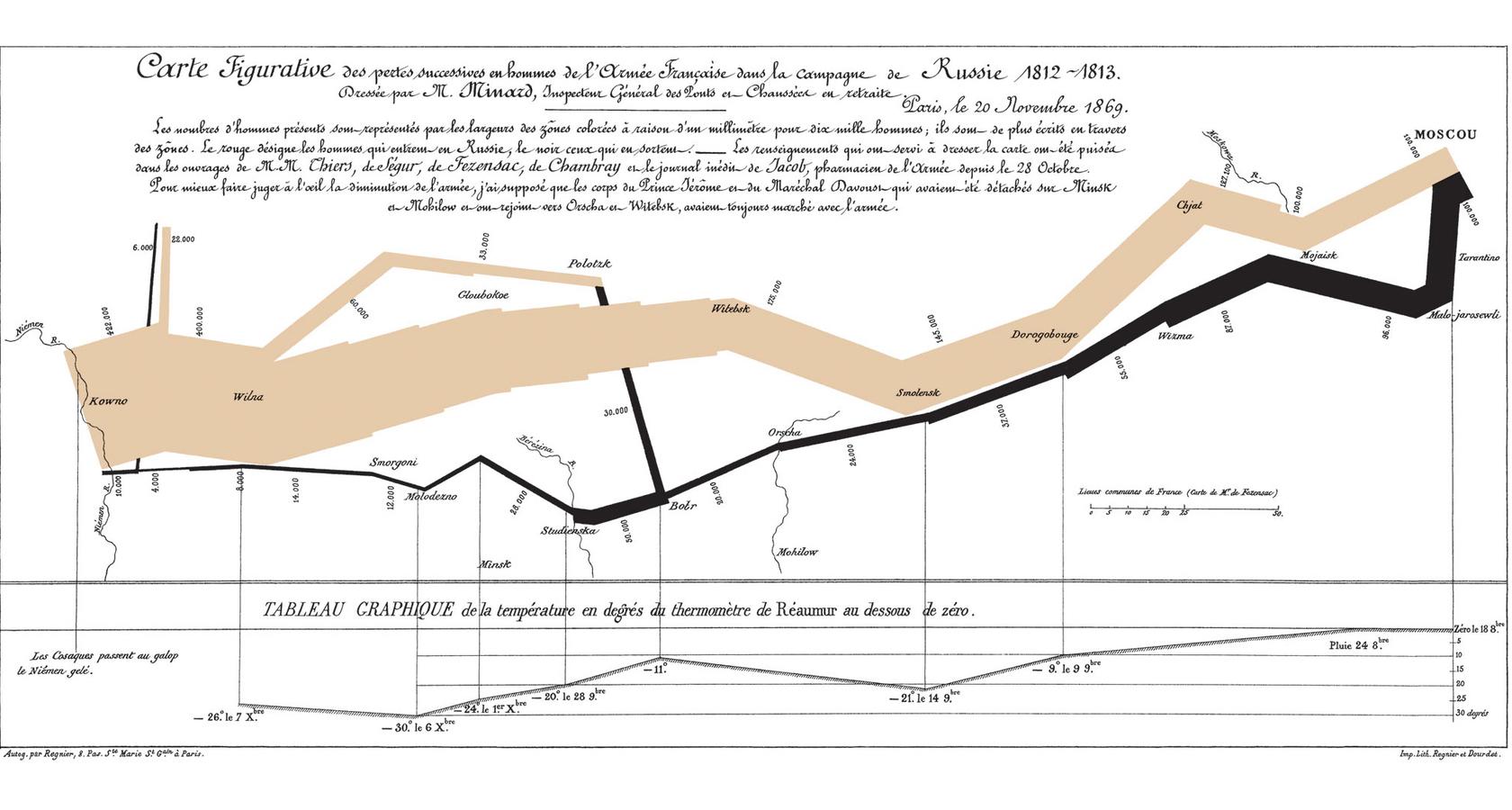
Napoleon’s 1812 March
Minard’s visualization of Napoleon’s 1812 march is regarded as one of the “best statistical drawings ever created”: Creating a visualization with as much information as Minard has done would have been impossible if it were not for the application of graphical excellence.
This single visualization shows the number of Napoleon’s troops by location, the temperature experienced by the troops, and the path the troops took to and from Moscow.
John Snow’s Cholera Map
John Snow’s 1854 graphic showing the location of London’s 13 public wells and 578 cholera deaths using stacked bars perpendicular to their location: It’s easy to understand, reveals the truth in the data, and gives the user all of the information they need to draw a proper conclusion regarding cholera deaths.

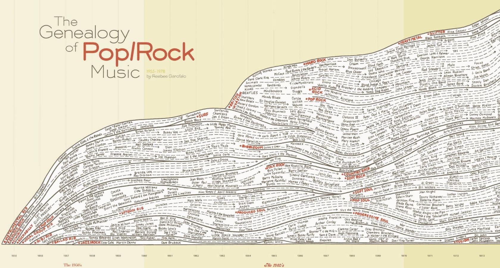
History of Rock Music
Representing only a fraction of the entire data visualization, the graphic below shows a portion of more than 30 styles of music from over 700 artists during the time period of 1955 to 1978.
It does not merely represent artists and styles, but shows influences, the volume of record sales, stylistic categories, and where these ended or continued. To achieve this sort of graphical excellence is no small feat.
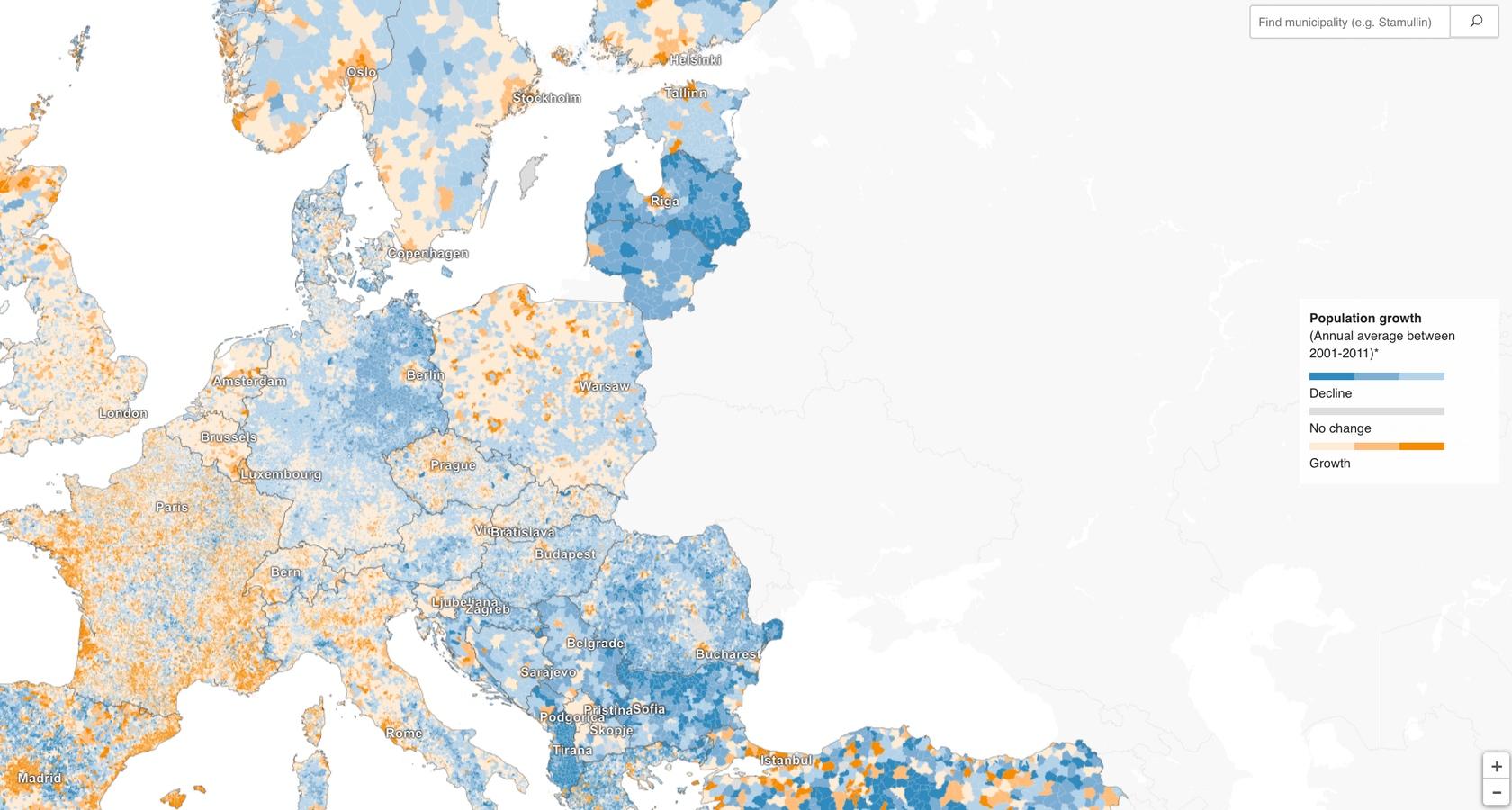
Where the Population of Europe Is Growing and Declining
A top data visualization showing how to deal with an immense amount of data in an uncomplicated, well-designed, and truthful way. There are also filters included on the interactive version that allow for even more data exploration, such as birth rates.
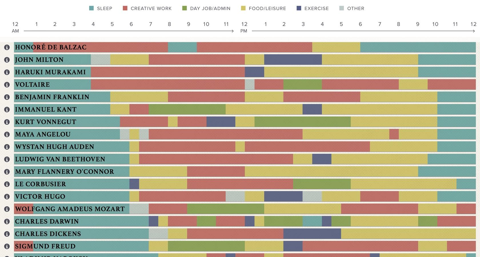
Daily Routines of Iconic Famous People
Not only is this data visualization interesting, it’s a classic example of graphical excellence. In one single graphic, we can see a detailed depiction of the daily habits, rituals, pursuits, and priorities of iconic famous people.
Using a simple color-coded chart, this visualization is easy to understand, simple, effective, and above all, informational.
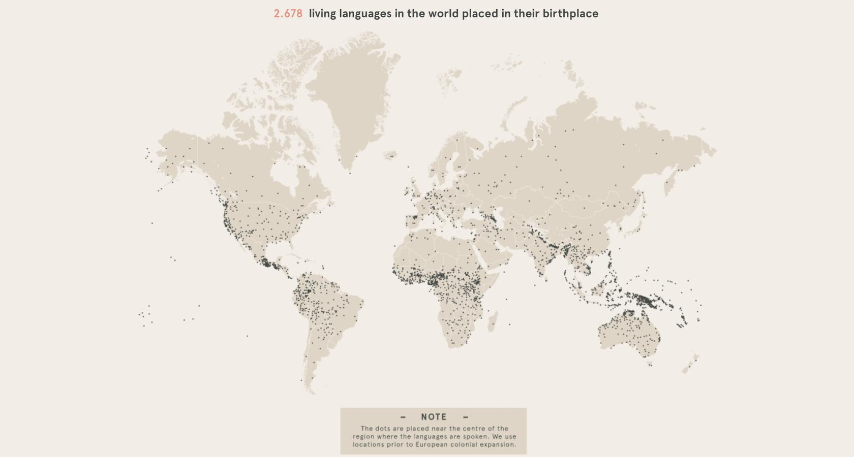
World Languages Graphic
This classic data visualization depicts the number of languages that exist on the planet, where they are spoken, and who speaks them in various pockets of the world.
Without a high level of graphical excellence, it would be hard to show this much data in such an elegant way that is also informative and easy to understand.
Top Dashboard Designs
For a dashboard to be considered superior, it must satisfy a set of specific UX criteria:
- Clear and consistent naming conventions
- The flow and layout of data prioritized
- Margins are appropriate for readability
- Data is neither hidden or overloaded
- Understandable and easy to read

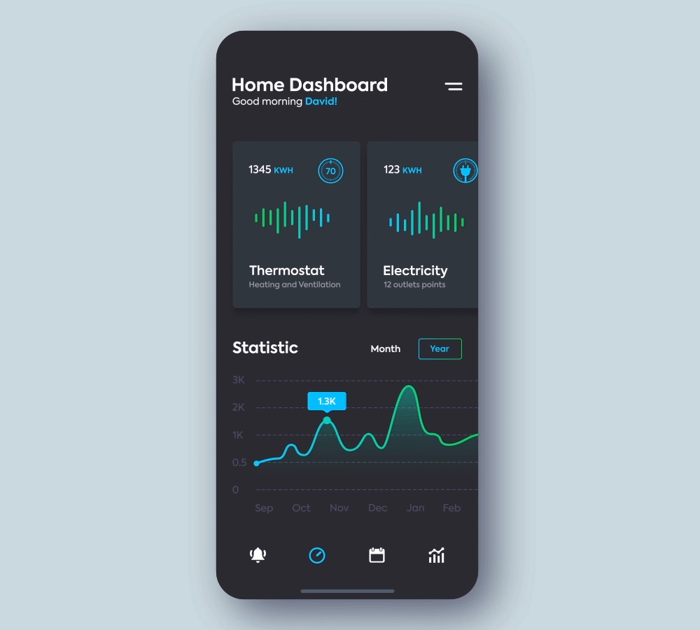
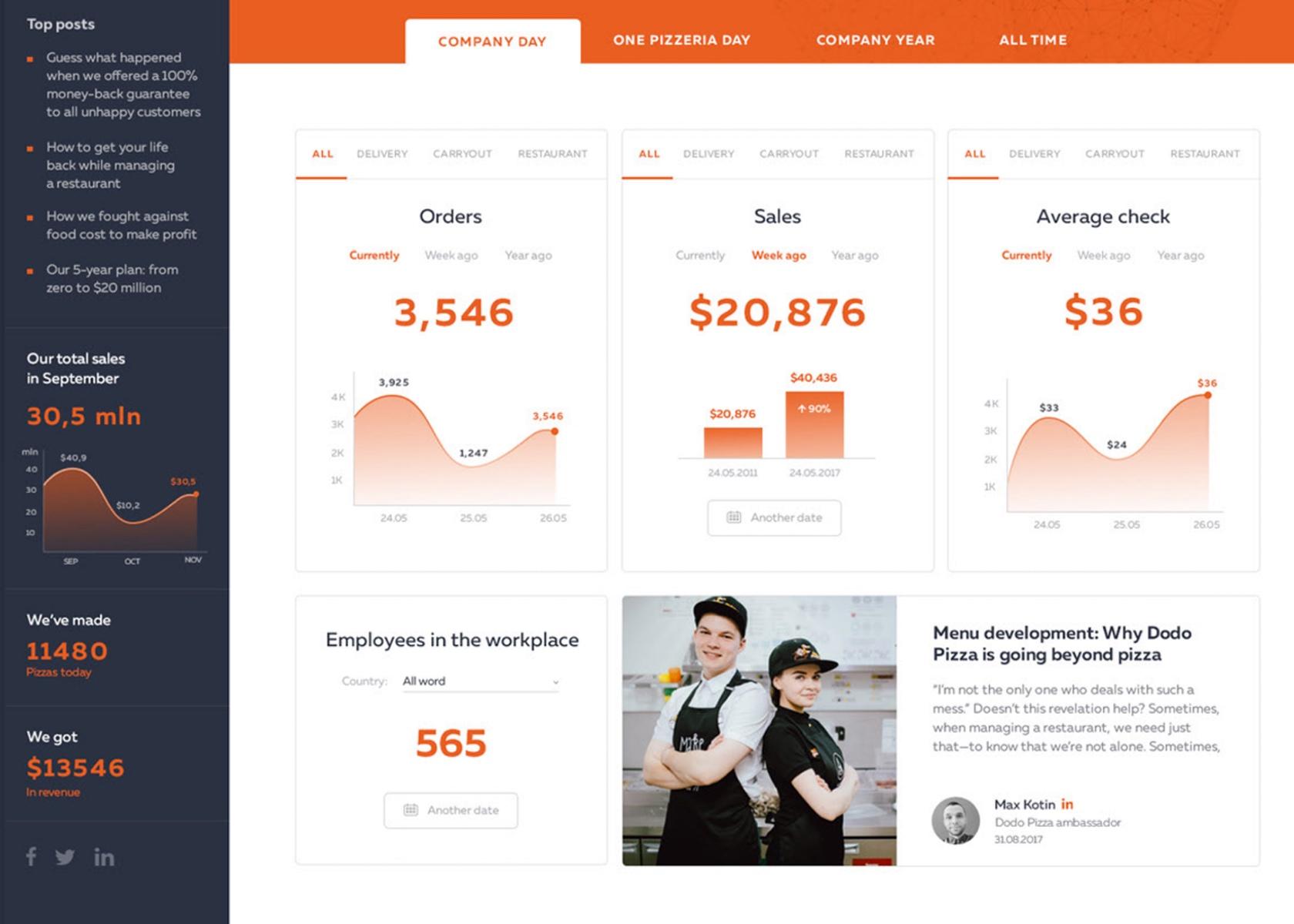
Marketing KPI Dashboard
The data visualization dashboard example below illustrates how to make complex business information easy to understand. The restrained color scheme is pleasing and the use of separate cards is soft on the eyes.
This is one of the best dashboard examples because of its data-ink ratio. The data and the space complement each other. Instead of filling the screen with more graphs, separate cards with small tabs are used. This is an ingenious way of keeping critical information available (i.e., not hiding it) while giving the user an easy and instructive way of viewing it on their own terms.
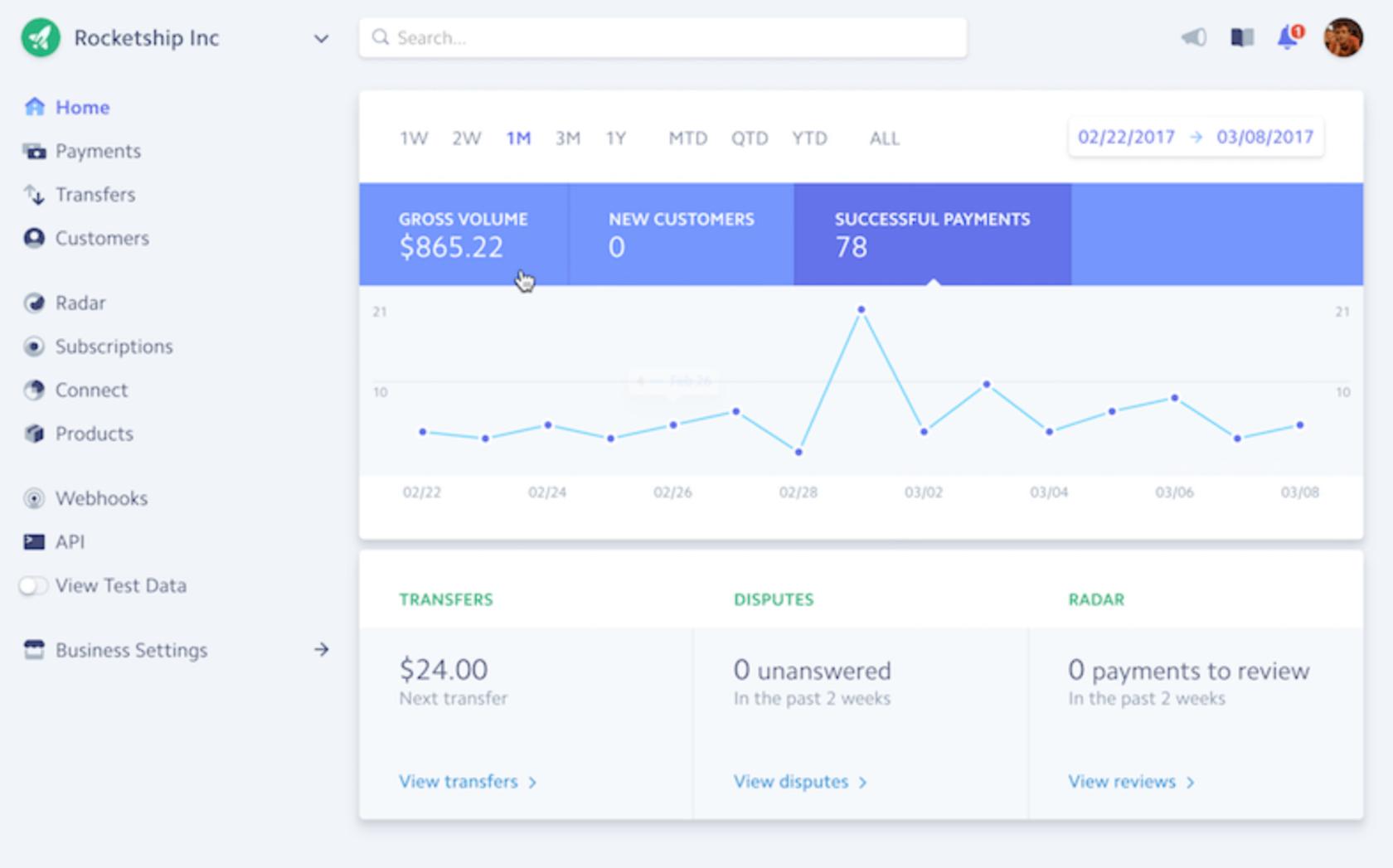
Stripe Dashboard
The Stripe dashboard is an excellent example of dashboard design best practices. It’s simple, answers the most pertinent user questions, and has near-perfect margins within each card.
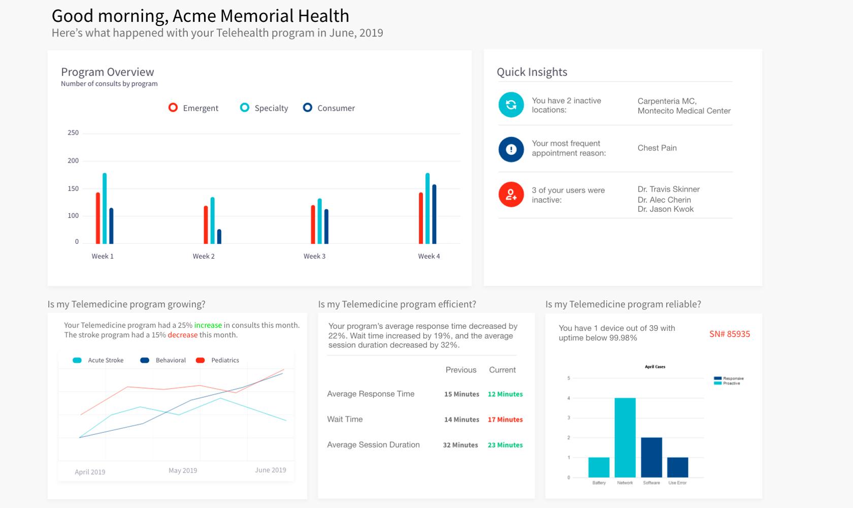
Telemedicine Dashboard
Telemedicine analytics are known for delivering a lot of raw data. Organizing that data into a meaningful and informative dashboard can be a challenge. This example uses dashboard design UX best practices. The margins are doubled, the information is presented with questions and answers, and data isn’t hidden from view.
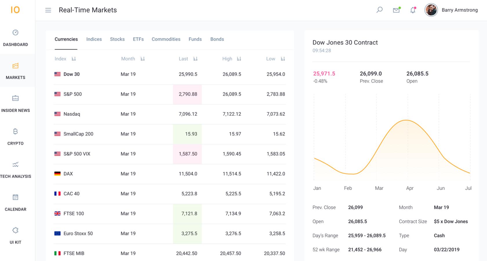
Stock Dashboard
Stocks can be hard to conceptualize on a single dashboard due to the number of data points competing for space. This dashboard design example has managed to accomplish a clean, minimal look with all of the pertinent information front and center.
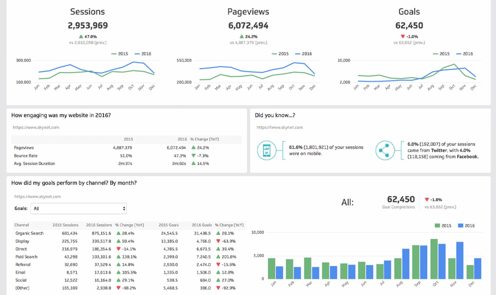
Web Audience Dashboard
Google Analytics does a great job with their dashboards; however, it can take a lot of customization to achieve a specific goal. This dashboard for data visualization has taken analytics to a new level by offering up a view that is simple, easy to understand, easy to read, and helpful, without increasing cognitive load.
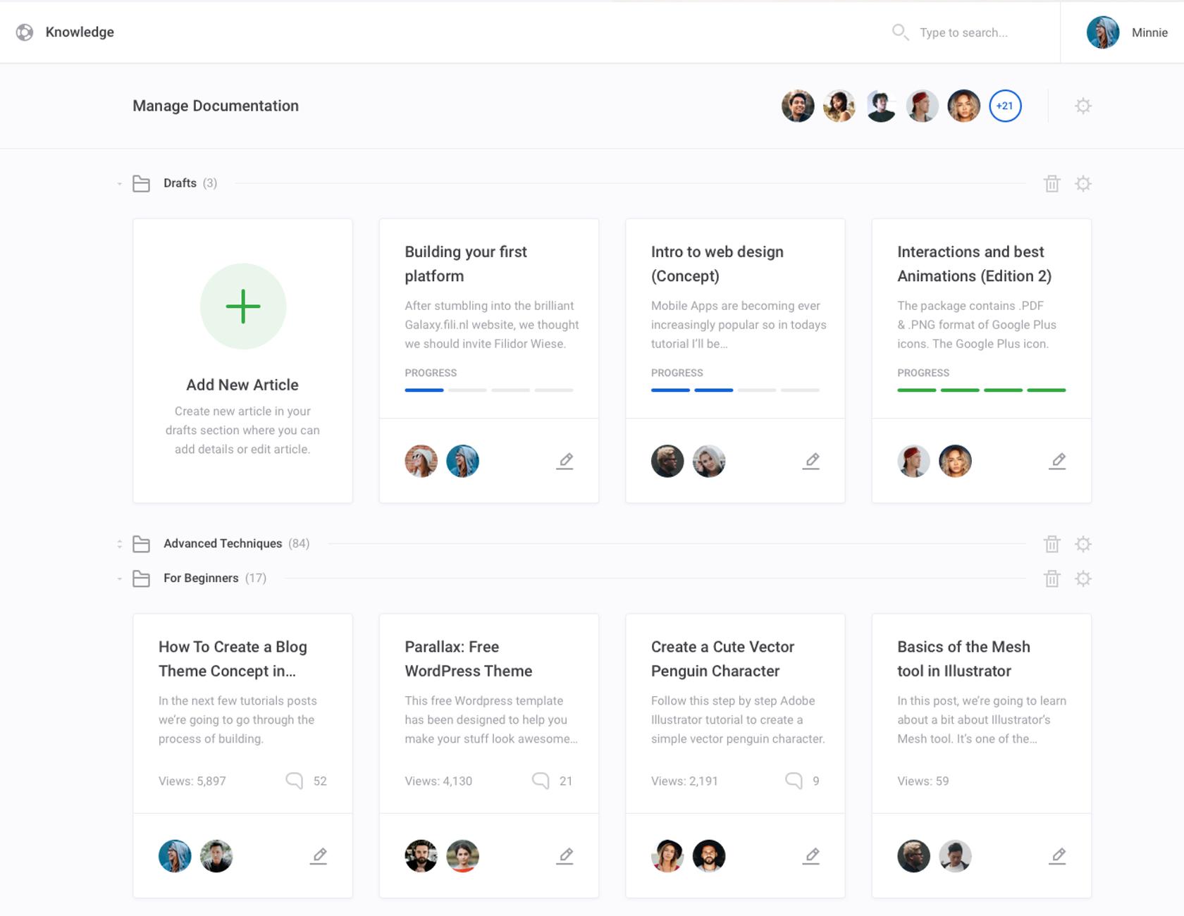
Documentation Management Dashboard
Managing documents is hard, but keeping them organized and easy to navigate can be even harder. An excellent solution is this dashboard which keeps things simple, understandable, and surprisingly sparse.
Even with a minimalist approach, this excellent dashboard design example gives the user everything they need in order to both understand and navigate the document system.
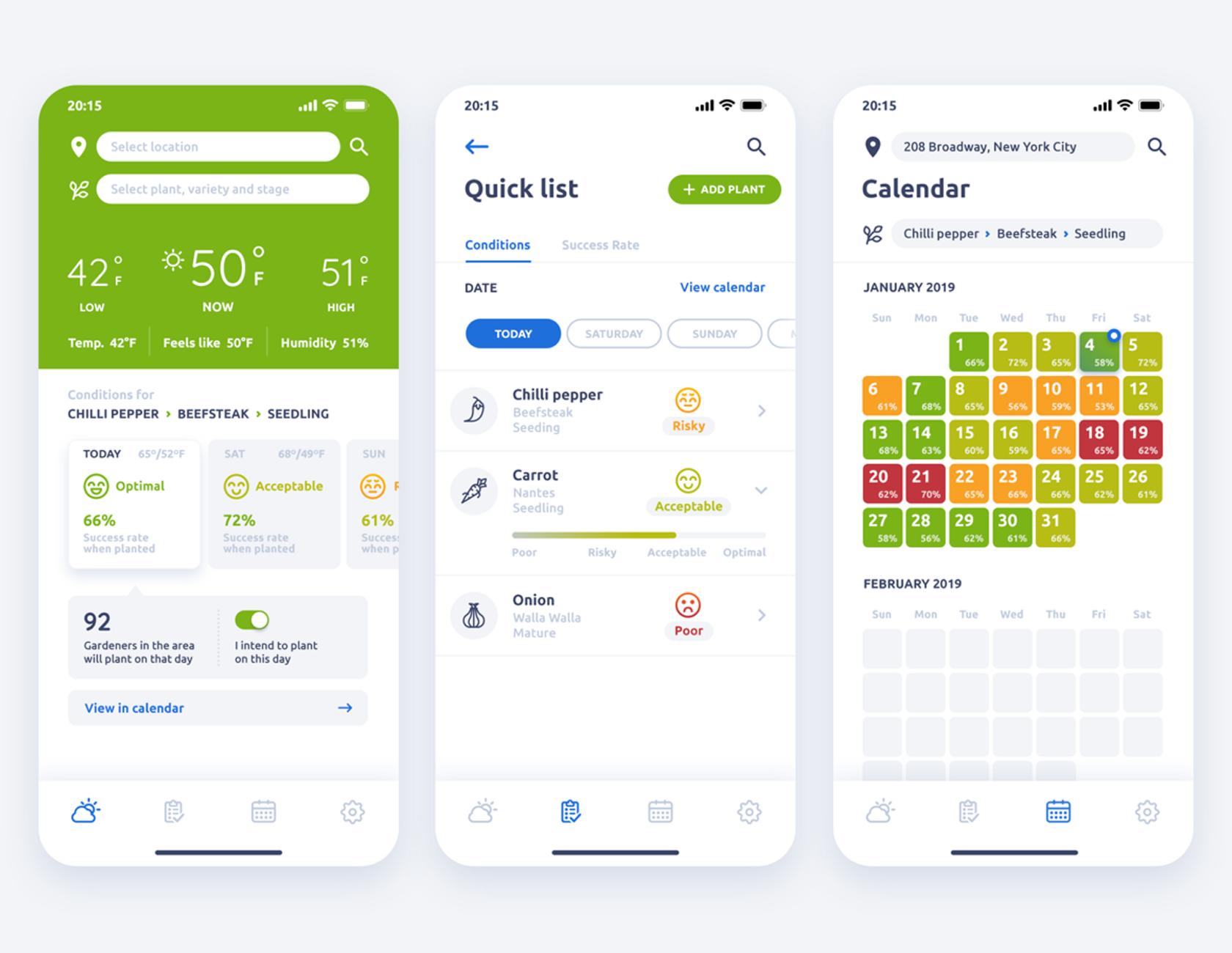
Plant Seeding Weather App – Mobile Dashboard
This mobile dashboard is informative as well as easy to understand. Breadcrumbs help with navigation, and icons with common language descriptions help to create great UX design.
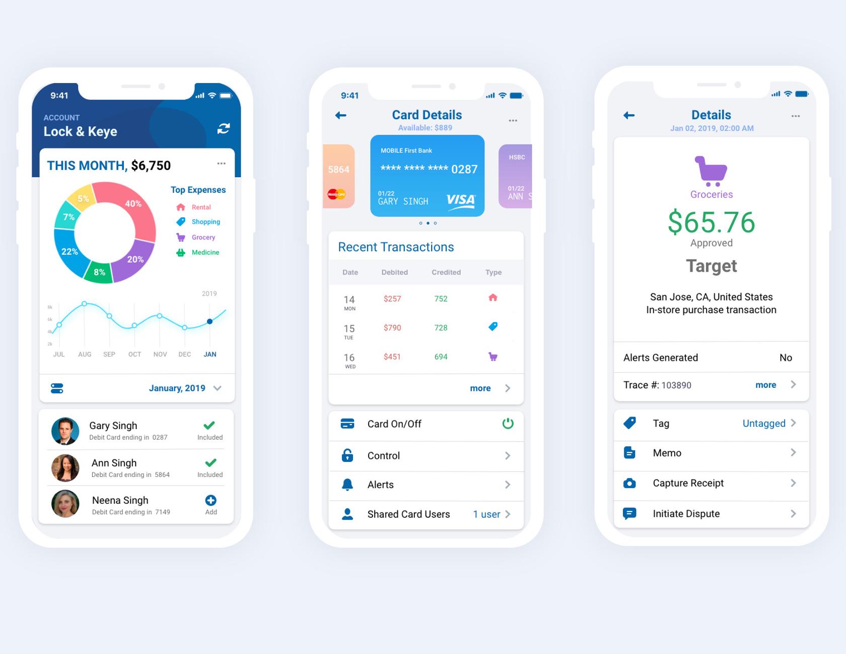
Credit Card Dashboard – Mobile Dashboard
Much like banking, credit card dashboards are notorious for bad UX, especially on a mobile device. This mobile dashboard design turns in a new direction. The information is not only well organized but understandable and feature-rich without being overwhelming.
Superior data visualization and dashboard design require graphical excellence and an understanding and application of dashboard design principles. Applied congruently, users will benefit from data visualizations that are informative and dashboards that deliver a high quality user experience.
Further Reading on the Toptal Blog:
Understanding the basics
What is dashboard UX?
Dashboard UX encompasses the principles of good UX design to deliver a superior user experience such as showing insights and not just data, designing for the user, following sound design principles, showing truth in data, and having a high data-ink ratio.
What is data visualization and why is it so important?
Data visualization is the graphical representation of information and data. It can be depicted as a chart, diagram, picture, etc. By using these elements, data visualization can provide a better way to see and understand trends, outliers, and patterns.
How does data visualization help?
Data visualization helps users identify trends and patterns in data. Its strength lies in the graphical representation, which allows people the ability to make better sense of complex and sometimes voluminous amounts of information.
What is a dashboard design?
Dashboard design is the ability to compile and display crucial data/information into a single, viewable space. It follows UX design principles and data visualization best practices, and it is organized so users can navigate directly to various areas that require the most attention.
How do you make a good dashboard?
Good design follows well-established dashboard and data visualization best practices, standards, and conventions. They have a purpose and present data clearly and consistently. Good dashboard design layouts flow naturally from left to right, use wide margins and padding, and display the right amount of information.