Influence with Design: A Guide to Color and Emotions
The right color palette encourages people to behave in ways designers want them to, while the wrong palette can turn visitors away before they take any action at all.

The right color palette encourages people to behave in ways designers want them to, while the wrong palette can turn visitors away before they take any action at all.

Seeing red. Feeling blue. Green with envy.
Popular idioms show that people have long associated colors with the emotions they evoke. People associate red with anger (or lust), blue with depression, and since at least Shakespeare’s day, green with jealousy. (He referenced the color green in relation to jealousy at least three times in his works.)
UX designers can utilize color to great effect in order to influence people’s emotions as well as their actual behavior. Color has the single greatest effect on how people perceive designs, yet too many designers do not spend the necessary time and effort to properly create color palettes for their projects.
That results in a lot of wasted effort and color palettes that aren’t necessarily influencing a desirable response to a product. And in a worst case scenario, colors can turn people off even when everything else about a design is optimized. This guide to color and emotions can help designers create and apply an effective palette.
Are There Positive and Negative Colors?
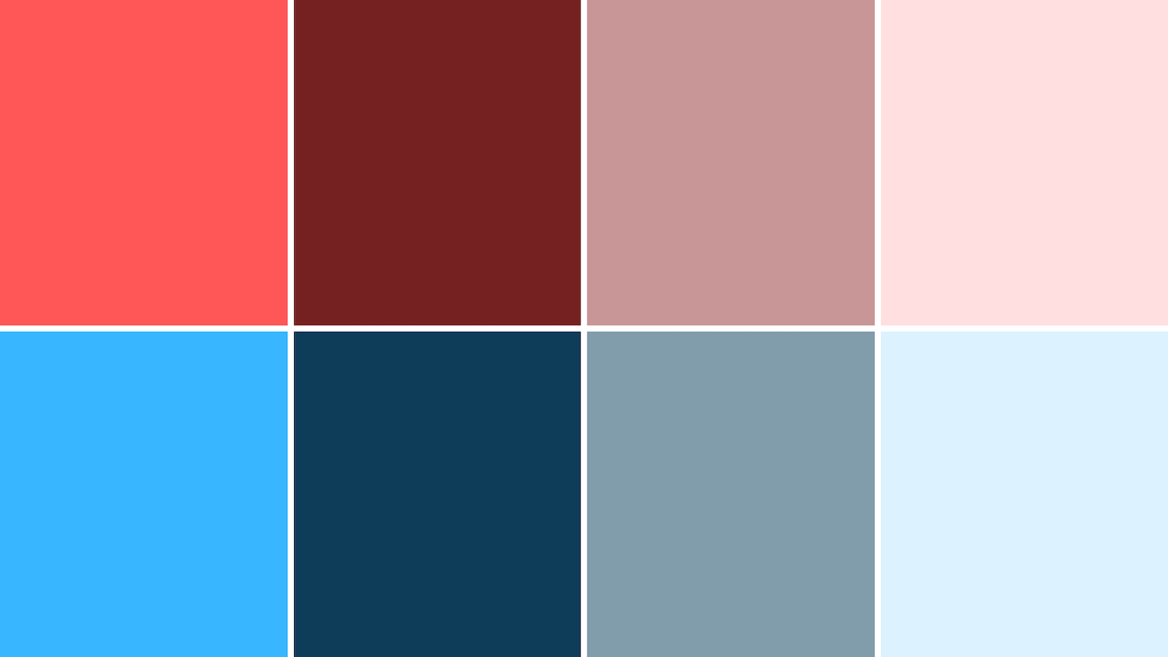
There’s a common idea out there that some colors are inherently positive or negative. Most often, warm colors (yellow, red, and orange) are considered to be positive colors, while cool colors (blue, green, and purple) are considered to be negative.
Still, those associations aren’t hard and fast rules. For example, red (a warm color), can evoke feelings of rage or danger (consider Holly Golightly’s monologue about the “mean reds” in Breakfast at Tiffany’s), while green (a cool color) can evoke feelings of growth and new beginnings. This is one reason why color psychology and color theory is so complex. There are seemingly endless factors that can influence how a color is perceived and how it affects human behavior and thought.
Cultural differences can also have a profound effect on color meanings. In many western cultures, white is largely associated with purity and peace, and yet in some Asian countries, white is associated with death and mourning.
It’s vital that designers pay attention to how the colors in their palettes work in harmony with each other, and how each color influences the others around it.
Psychological Effects of Colors
Warm colors tend to be invigorating and lively. They are typically energizing and can add life to a design. Rather than blending into the background, warm colors “pop” on the screen or page and tend towards being in the forefront of a design.
One interesting thing to note with warm colors is that two of the three primary colors (red and yellow) are warm, with orange, a secondary color, being a combination of the two. This means that for the most part, warm colors are purely warm, i.e., primary, and cannot be mixed from other colors.
Cool colors are more likely than warm colors to be perceived as calm. That’s not always the case, though, especially since green and purple, which are secondary colors, are created by combining a primary cool color (blue) with a warm color (yellow to create green and red to create purple). This means that while those hues are considered “cool,” they can take on some of the characteristics of their warm aspects.
Green, particularly lighter and brighter versions, can be associated with life and positive energy. Purple, especially when it’s brighter (like fuschia) or lighter (like lavender), can be a very lively color.
Neutral colors (brown, tan, gray, white, and black) tend to take on the characteristics of the colors they are combined with, though they can also subdue or enhance those effects. For example, combining warm colors with white can create a design that appears lighter (in terms of weight, not just in terms of overall vibrancy) and carefree. Combining those same warm colors with black can make them appear more intense and dramatic. Combining cool colors with black can make them more mysterious, while combining them with white can make them more calming and relaxed.
Effect of Color on Consumer Behavior
Color can affect a person’s mood or thoughts, but can it also affect their behavior?
Yes, absolutely.
Marketers have long relied on color to influence consumers to take certain actions. It’s why signs in shop windows meant to grab passerby attention are often yellow, and sale prices are often denoted in red.
Many of these choices are based more on tradition than hard science, but that in turn has created an expectation among consumers. When they see a red price, they assume that whatever they’re looking at is on sale or clearance. When they see a yellow sign in a window, they take a moment to read it because they expect it will include pertinent information (yellow is one of the colors most visible to the human eye, so it naturally draws attention).
Here’s a brief rundown of how each hue affects consumer behavior (more detailed information on the use of color for marketing can be found in this infographic from Suyati).
- Red is strongly associated with buying and sales. If used too heavily, it can turn some customers away.
- Orange can be used for calls to action but can also be irritating if overused. This is why it’s not often seen outside of logos or accent colors.
- Yellow attracts focus and grabs the attention of consumers.
- Green is easily processed by the human eye, and is therefore often used to create a sense of relaxation. It’s also strongly associated with money and luck.
- Blue is the world’s favorite color, so it’s no surprise that it’s used extensively in communications of all kinds. It’s also strongly associated with loyalty, honesty, and power, making it a popular choice for large corporations and businesses in more conservative industries (like banking and insurance).
- Purple is used heavily in the beauty products industry, although it’s also seen associated with luxury goods (like Asprey, which even named its signature perfume Purple Water).
- Black is generally sophisticated and elegant when used in marketing. It’s used extensively in communications across most industries.
- White is often associated with cleanliness, and is therefore popular in the healthcare industry. It’s also used in the tech industry because of its association with simplicity.
- Gray is also associated with simplicity, and is often used by marketers to calm and soothe consumers.
Again, the effect each individual color has on consumer behavior is influenced heavily by the way in which it’s used as well as the context of the content.

Creating Emotionally Powerful Color Palettes
Many UX designers think that certain colors “can’t” be used in certain situations. That kind of thinking is outdated and has no place in modern design.
Let’s look at Pantone’s Color of the Year for 2019: Living Coral. This is a strong hue, and one that many designers might shy away from using for a lot of projects. (Note: I’m not advocating jumping on this particular bandwagon just for the sake of following trends, but it’s a good starting point for an experiment.)
After all, what place does Living Coral have on something like a banking website or a website selling men’s suits (although props to the men out there who can rock a coral suit)? But here are color palettes that could be used for a variety of industries that incorporate Living Coral, just to prove that almost any color can be used for any project a designer wants when used in the right context.
Not sure how this is helpful? Think about clients who come to a designer with a project and insist that a particular “brand color” be used, even though that color is hideous.
Here are four examples of color palettes that incorporate Living Coral, suitable for a variety of industries.


Four different palettes, four entirely different feelings. The same type of experiment could be done around virtually any color.
Another way to incorporate seemingly inharmonious colors in a design is to change the value of the hue by adding either black, gray, or white to it.
Creating a color that is more muted (adding gray) will make it feel more relaxed. Adding black to darken a color gives it a more traditional or conservative feeling. Adding white to lighten colors gives them a more innocent and peaceful feeling.
One of the most overlooked parts of color theory is a designer’s ability to trust their instincts. Color is highly subjective and, while there are certain guidelines, it’s still a relatively unstudied area of design.
Designers should follow their instincts in trying out various color palettes and ideas, and then do user testing to prove whether their instincts were correct or not. User testing, A/B testing, and other methods of gathering data about the efficacy of various color palettes are invaluable in creating final designs.
Conclusion
The relationship between color and emotion is one of the most important aspects of good UX design. The right color palette encourages people to take actions on a site or with an app that designers want them to take, while the wrong palette can turn visitors away before they take any action at all.
Choosing the right color palette is part art and part science. When it comes to designing an initial palette, designers should follow their instincts along with available research, and then test and retest to guarantee the color palette is reinforcing the overall purpose of the design.
Further Reading on the Toptal Blog:
Understanding the basics
How does color affect us?
In design, a color palette creates a mood. Warm colors tend to be invigorating and lively. They’re often energizing and can add life to a design. Cool colors are more likely to be perceived as calm. Neutral colors tend to take on the characteristics of the colors they are combined with, though they can also subdue or enhance those effects.
What are the most powerful colors?
Colors and emotions are strongly linked. Virtually any color can be emotionally powerful when used in the right context. However, pure hues (those that don’t have white, black, or gray added to them) are more visually powerful than shades or tints.
What is the psychology of color?
The psychology of color is the study of how different hues affect human behavior. The psychological effects of color have been widely documented anecdotally, though few comprehensive academic or scientific studies have been carried out. In design, color psychology can help designers evoke emotions or guide attention.
What colors are positive?
Most often, warm color schemes are said to comprise a positive color palette while cool colors are said to be negative. But red (a warm color), for example, can evoke feelings of rage, while green (a cool color) can evoke feelings of growth and new beginnings.
Who came up with color theory?
Physicist Isaac Newton is largely credited with discovering color theory. He was the first person to create a color wheel in 1666. He also discovered that light splits into various colors when it passes through a prism, which became the basis for much of color theory for designers.