
This is a guest article by a business copywriter Erica Sunarjo.
Animations are frequently used as a tool to demonstrate or explain concepts. Done right, they can really add to the user experience. Not only can they increase understanding, but they can also better hold the user’s attention.
Then, there’s the undeniable enjoyment factor. Let’s face it, most people would rather watch an animation then review a page of dry, boring text. This is where User Experience (UX) design comes into play.
It’s important to take the end user’s emotions, preferences, and needs into consideration when designing the animations for your site, eCommerce store, or blog. According to statistics, animated explanations and guidance videos in online stores increase leads and conversions up to 20 percent. This is a very important factor to consider given the increasingly competitive online market. In order to use animation to create the best possible experiences on your website, stick with some best practices in the following areas:
1. Animations should be relevant
Once a designer begins to master animation, it’s easy for them to get caught up in the "wow" factor of it all. Without some judicious handling, a tool that is ideal for some cases can erroneously seem as if it’s the perfect solution for all of them. It may help to divide animation into two categories.
Functional animation. This is the subtle animation that is built into UX design. It’s based on the idea that people naturally track moving objects with their eyes. Functional animation makes a website more intuitive and responsive.
The "wow" stuff. To be clear, this shouldn’t be dismissed as superfluous or silly. This is the kind of animation that can make a particularly boring bit of information a bit more interesting, add visualization right where it’s most needed to explain a point, or simply to add some entertainment value to whatever it is that you’re presenting.
Functional UX, as long as it works, is never bad. The extra stuff is okay too, as long as it actually contributes to better user experience. Does it make the web page easier to use, the content easier to understand, or make a particularly mundane part a tad more interesting? Then go for it. Otherwise, it may be a good idea to scale back.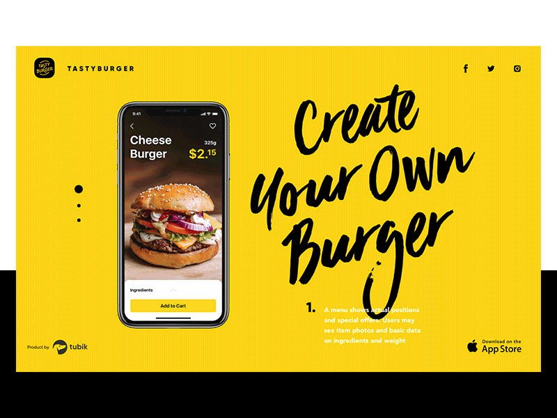
Good example: UI Design for Food Ordering App by Tubik Studio
Bad example: Stop Gratuitous UI Animation by Sophie Paxton
2. Animation should be a supporting player
Animation should never take the starring role. Instead, it should be a part of an ensemble of methods that work together to create a great interaction design. Remember, that the purpose is to create a functional experience, not a platform for showing the designer’s animation skills.
Animation should be a complementary part of the design. It should help the user to accomplish whatever tasks they need to at that point in time. It should make their interaction with the webpage smoother, more natural, and more intuitive.
It’s good practice to pair animators with web designers or graphic designers with site administrators when creating the overall UX of your website. The more cohesive your website seems to the naked eye, the more approachable and attractive it will be to potential visitors. Not to mention the benefits to your site’s SEO ranking as a result of planned, deliberate design decisions instead of ad hoc design.
Good example by JT Grauke
Bad example: Sidebar Animation by Jacub AntalikRamotion.com
3. Animation should never slow down the experience
Animation can certainly add a lot to the user experience. Unfortunately, if it lags, any benefit is lost as the user only focuses on the performance issues. If your animations are running slower than 60 frames per second, that’s going to be perceptible to the user. Fortunately, there are several steps you can take to improve the performance of your animation. These include:
- Using updated animation libraries
- Keeping code to run animation separate from code that handles events such as user scrolling
- Being judicious about what you animate
- Avoiding simultaneous animations
- Waiting until the page begins to load to kick off animations
- Most importantly - performance testing your animations
You can also use animation to alter the way users experience time. For example, you can use multiple animations while one process is happening in order to make it seem faster to the user. This can lead to increased engagement.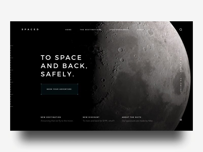
Good example: SPACED booking by Gil
Bad example: Electro by Cosmin Capitanu
4. Motion should be natural
Ultimately, animation is adding movement to your screen. To create the best possible experience, that movement should be natural.
Imagine watching a cartoon. A character drops a bowling ball. Rather than falling fast and heavy the air catches it and it kind of drifts down to the ground. If you react like most people, that would take you right out of the story. The reason for that is that you expect the laws of space and motion to apply, even though you know that you’re watching something created in an entirely man-made environment.
No, this doesn’t mean that objects moving on your web page should exactly match the way they should move in real life. What it does mean is that you should be aware of the impact that the perception of motion can have on the user.
That includes the rules of physics as mentioned above, but there are other factors to consider. For example, if you ask the user to click on multiple boxes to select products they want, and they do so quickly, the animation won’t feel right unless it responds accordingly.
Good example: Travel Motion Exploration by Nick Taylor
Bad example: Web Animation: Delightful or Distracting? by Constructive
5. Animation should reflect branding
It’s true, animation can reflect or distract from your brand. Obviously, this goes into the "wow" category of animation, but it’s also something to remember in functional animation design. Think of the simple act of dragging an element from one side of the screen to the other.
The way that motion looks can really vary. The object can retain its shape as it moves. It can also distort as its being dragged across the screen. It can move in one flowing motion, or it can skip and drag a bit. It can even be bouncy. Each of those types of movements has moments where they would be absolutely on point and others where they would be completely inappropriate.
For example, animations that jiggle and move may be perfect for an education website for children. Not only would that be on-brand for a fun, learning website, but it might also help inexperienced computer users with functions such as ‘click and drag’ or scrolling. On the other hand, that same motion wouldn’t work well at all for a financial services website. It would appear silly and whimsical, traits that are presumably at odds with established branding. A style guide for UI may help animators and visual designers easily get the hang of your branding style.
Good example: Promo page by uixNinja
Bad example: Sticker app by Brad Groux
6. Animations should consider technical guidelines and communication
Whether you are a user trying to understand UX design, an experienced designer, or a tester, you should seriously consider studying the 12 basic principles of animation. If trying to understand what the designer wants to accomplish or to communicate your thoughts successfully, these principles can give you the vocabulary you need to communicate effectively. At the same time, designers can use these principles to help explain concepts using that shared vocabulary.
To apply some of the guidelines and techniques mentioned here, UX designers often make use of animation tools. These provide them with the ability to provide better UX with less time spent overcoming skills gaps. Here are some tools that come highly recommended:
Sketch - for rapid prototyping
Lottie - an open source animation tool developed by Airbnb and hosted on GitHub
ProtoPie - sensor sided prototyping, animations, and interactions
Adobe After Effects - motion graphics and digital visual effects
Kite Compositor - animation and prototyping for Mac and iOS
One of the key differences between a designer and a coder is the ability to focus on UX without getting bogged down by syntax. By using animation libraries, designers can implement the right technique at the right time quickly and efficiently. Here are a few to consider:
Bounce.JS - this is a JavaScript animation library that allows you to include cartoon style, "bouncy" animations on your website.
DynCSS - try this animation library with parallax scrolling websites.
Hover.CSS - this library allows you to add hover effects and other subtle movements that impact buttons, logos, etc.
CSS Shake - as its name suggests, this animation library allows you to add a "shake" effect to elements on the screen. Check out this list of other helpful CSS tools.
Final thoughts
If you take the time to learn some basic principles as well as use some of the many popular tools and libraries available to you, animation can help you create improved user experiences on your website.
Whether you are a junior graphic designer or an experienced art director in your company, chances are that you will want to implement animation into your existing content calendars. Keep these guidelines and best practices in mind and your web pages can be more intuitive and engaging – not to mention the subsequent increase in traffic and conversions that come with it.

Erica Sunarjo graduated from South Texas College majoring in Marketing and Creative Writing. She used her knowledge to make a difference in the realm of business copywriting and invested heavily in traveling and language learning. At present, Erica is fluent in French and Spanish, studying Chinese and working her way to being a multilingual copywriter. She keeps track of the latest trends in IT and technologies, blogs about efficient strategies in education and business coaching, holds educational webinars. Right now Erica is a translator at The Word Point.