Heatmaps Make Ops Better
By Danyel Fisher | Last modified on July 21, 2023In this blog miniseries, I'd like to talk about how to think about doing data analysis "the Honeycomb way." Welcome to part 1, where I cover what a heatmap is—and how using them can really level up your ability to understand what's going on with distributed software.
Heatmaps are a vital tool for software owners: if you're going to look at a lot of data, then you need to be able to summarize it without losing detail. When I'm dealing with data, I find it really helpful to be able to see precisely what data points make up the result of a query, and to zoom down to see individual events. Heatmaps, in their way, best represent what Honeycomb is really about: re-displaying events back at you.
I'm not the first to say that: Chris Toshok wrote a great blog entry on heatmaps a year ago when we first launched them. Heatmaps are no longer the New Hotness. They're just a critical part of understanding your system with Honeycomb.
Unfortunately, the word hasn't spread as widely as it could yet. Heatmaps can be difficult to understand. I want to talk about the real power of what makes a heatmap special, and how to use it — and why devops really shouldn't walk out the door without one.
Why heatmaps?
We all, I think, know what a scatterplot is. Given a number of multi-dimensional events, pick two continuous fields and place them on the X and Y axes. A reasonable choice might be to pick, say, the time of day on the X axis, and the duration of a given event on Y. With a few hundred points, it's easy enough to read—but any noise in the data can hide the effect that's in the data.
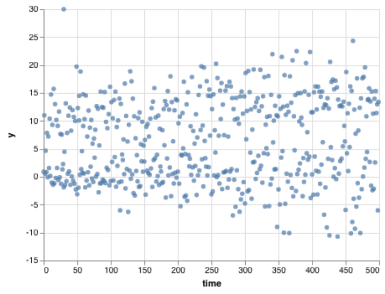
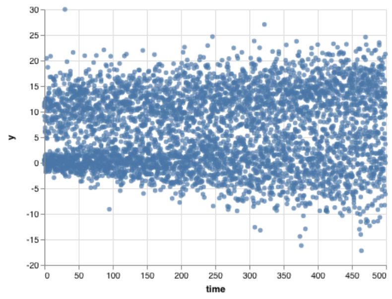
We can learn more by drawing more and more points. But sometimes a scatterplot gets crowded. Draw a few thousand points, and they start to run into each other. I think this image shows that there's an upper group and a lower group, but it's hard to tell how they are different.
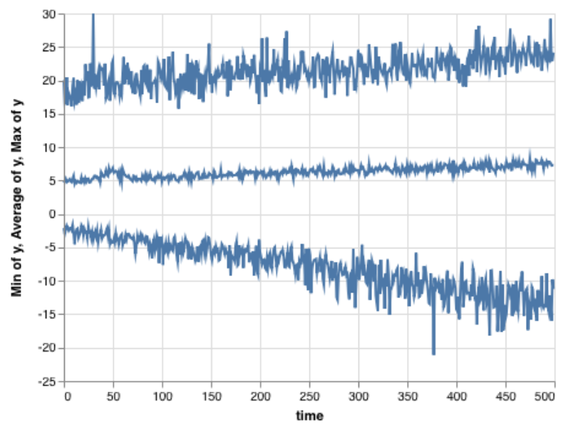
There are a few options to address this problem of overplotting. One classic strategy, especially for timelines, is to summarize and aggregate the data. By grouping the the x-axis into bins, the visualization can choose an aggregate across the measure and draw it as a continuous line. In this chart, the average, minimum, and maximum show the general trends of the data — but at great cost. There's almost no detail visible.
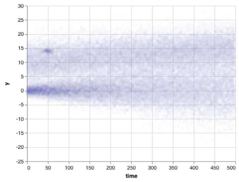
Another choice is to make points fainter and blurrier. That works pretty well, if we want to track where the bulk of the data are. It has some tradeoffs: if with millions, or billions, of points, we need to get really very blurry. This blurred version definitely shows the general trend of the data — including the fact that the bottom curve started off tighter, while the top didn't — and shows the thick cluster around time 50, y = 14.
Unfortunately, summary values miss critical points. As an alternative, we could bucket the data into bins in both the X and Y dimension. Within each bin, we'll show how many items fall there. Bright colors will mean many items; dull colors mean fewer. But if there's even one point, we'll at least render a single dot.
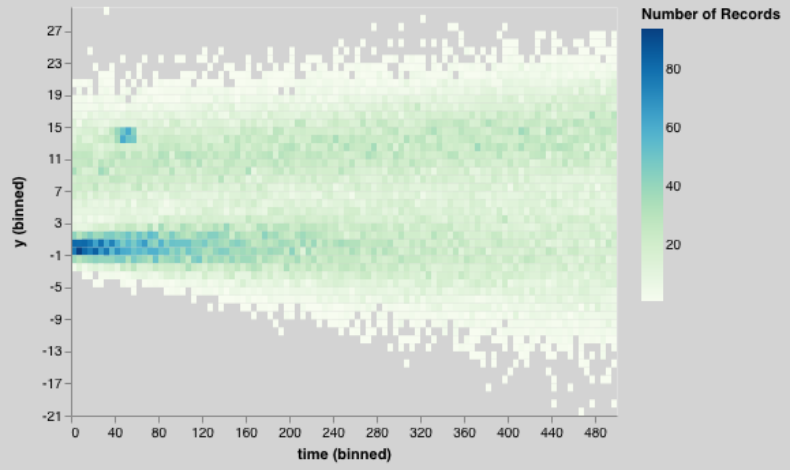
This chart is the total package: we can see that the data seem broken into two sets, a lower one and a higher one. We can see that the lower one started tighter and got wider. We can see that the upper one was wide all the way through.
We can see a bright patch — and we can also see an outlier in the top-left corner that the previous charts couldn't show.
The heatmap simply shows more information that other visualization types.
How do we apply this to ops?
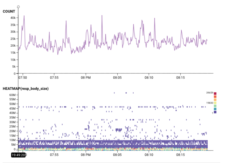
A heatmap is a great way to see the real richness of a dataset. Knowing that almost all data returned by this query has a resp_body_size less than 10M bytes — but that there is one row of data with a body size of 48M bytes — tells us a lot about this dataset:
Heatmaps aren't for everything
Admittedly, there are things a heatmap isn't great for. It's hard to read a percentile directly off a heatmap: if a service agreement requires you to track percentiles, I'm certainly not saying you shouldn't know what your slowest 5% of users are seeing. But as soon as you want to dive into the real pattern, it's hard to substitute for the value of a good heatmap. It's also hard to read a count directly off a heatmap; almost every time I create a heatmap, I also draw a count.
But I'm willing to pay those costs for the amazing power of a heatmap: different colored areas in a heatmap often correspond to different sorts of behavior. With a little practice, you can start to recognize distinct patterns and shapes in a heatmap — which makes them an incredibly powerful tool!
A vertical colored area or a blob means a change at a particular time: it might mean a crash, or change in activity. It's worth looking around the event to figure out what might have changed. It might mean that one user, or resource, or data center started acting differently?
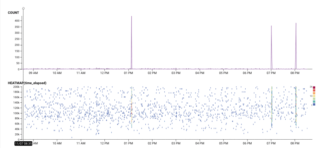
In this example, we see that while this ruby gem is downloaded regularly, once in a while around a hunderd events happen all at once. What do those mean?
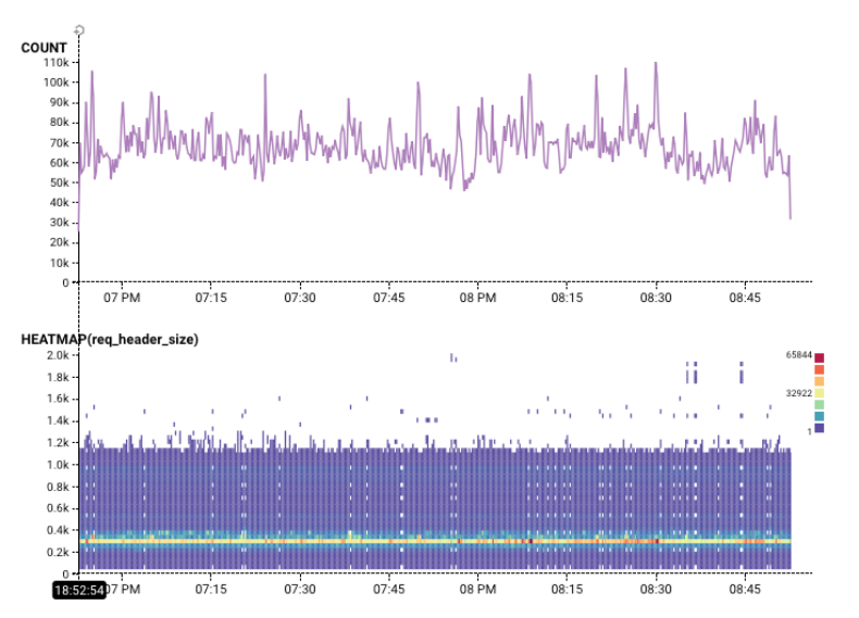
Horizontal colored areas usually mean that there are several different modes of operation. For example, in this chart, there is clearly something distinct about request headers that are almost exactly 3000 bytes:
Diagonal lines are rarer, but they tend to mean that something is changing over time. For example, in the Gatekeeper Tour, this wedge shows a traffic backup! As time progresses, packets gets more and more held up. (The Count helps show that throughput is also destroyed).
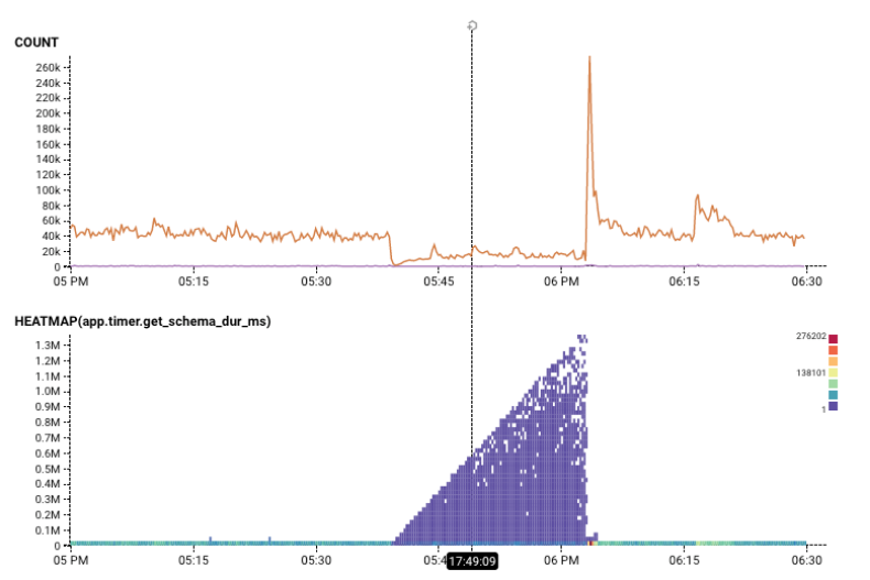
Wouldn't it be cool to create a visualization that separated out these different layers? If I break this down by one dimension, app.hitSchemaCache, we can see the heatmap conditioned on that variable. Hovering the mouse over different rows of the result table pull out the different rows. It's pretty clear that the phenomenon only occurs when that variable is false — when the cache was missed.
In the next blog entry, we'll call this out as the Core Analysis Loop. Until then, keep exploring the Rubygems dataset, or go check out our play demo, which goes through a heatmap scenario in the “Gatekeeper Tour”.
Footnote: Did you notice that most of these queries have a filter on them? In Honeycomb, we want to make sure you get to see all the wild outliers and excessively-high values. A few high values, though, can hide all the interesting stuff at the bottom. You'll know its happening because, well, everything else is a light scattering of blue, and the bottom has a colorful red line. It's an easy fix! Just add a “time_elapsed < value” into the filter box. That'll adjust your axes, and bring out all that important detail.
Want to learn more?
- The canonical paper on creating heatmaps from lots of data points is perhaps Hadley Wickham's “Bin, Summarize, Smooth.”
- Alper Sarikaya works through a number of different combinations of ways to summarize large data scatterplots in his paper (and Github repo), ”Design Factors for Summary Visualization in Visual Analytics”
- The figures in the first half of this were written in a Jupyter Notebook, using the Altair/Vega-Lite. Vega-Lite and Altair made it impressively easy to express these ideas very directly.
Think heatmaps are pretty and want to make your own? Try Honeycomb for free!
Related Posts
Introducing Relational Fields
Expanded fields allow you to more easily find interesting traces and learn about the spans within them, saving time for debugging and enabling more curiosity...
Real User Monitoring With a Splash of OpenTelemetry
You're probably familiar with the concept of real user monitoring (RUM) and how it's used to monitor websites or mobile applications. If not, here's the...
Transforming to an Engineering Culture of Curiosity With a Modern Observability 2.0 Solution
Relying on their traditional observability 1.0 tool, Pax8 faced hurdles in fostering a culture of ownership and curiosity due to user-based pricing limitations and an...