Shoelace 2.0: A Forward-thinking Library of Web Components

A few years ago, I released a lightweight alternative to Bootstrap affectionately named Shoelace. Shoelace was small and fast because of its minimal design and pure CSS approach to styling. It used CSS custom properties extensively to enable customizations, even when loaded via CDN — something you can’t do with Sass.
At the time, CSS custom properties were still pretty new.
Fast-forward a few years and things have changed. CSS custom properties are ubiquitous and a relatively new technology, called Web Components, has landed in all modern browsers.
Web Components
If you’re not familiar with Web Components, they’re a collection of standards that let us create our own HTML elements, complete with DOM and style encapsulation. Turns out, this was exactly what I’d been waiting for!
I decided it was time to rebuild Shoelace from scratch, so I kicked off 2.0 with a few goals in mind:
- It should work with CDNs
- It should be easy to use and have good documentation
- It should be fully customizable with CSS (no preprocessing)
- It should work with any framework (or with no framework at all)
- It should be built with accessibility in mind
These were ambitious goals, so I turned to my favorite tool for authoring Web Components. Stencil is a compiler that generates standard-compliant custom elements. I like it because it offers some really nice conveniences such as TypeScript, a beautiful component API, lazy loading, and multiple output targets.
I highly recommend Stencil if you’re interested in building your own Web Components!
Redesigning Everything
With requirements and tooling out of the way, I began rebuilding everything from scratch. Every single component was carefully redesigned with a fresh UX and a reimagined API. I even added some new components, including utilities for animation, using the Web Animations API; form validation, using the Constraint Validation API; and responsive embeds.
Suffice to say, I’m quite happy with the result. Meet Shoelace 2.0
And as far as my requirements go, they’ve all been met!
- ✅ The preferred way to use Shoelace is via CDN
- ✅ The documentation is pretty extensive and includes many working examples
- ✅ You can customize components at a high level with CSS custom properties and at a low level with CSS parts
- ✅ You can use Shoelace components in any framework you want
- ✅ Each component was built with accessibility in mind, and there’s an ongoing effort to improve them even more
A Better Developer Experience
A huge advantage of using Web Components is that you get real custom HTML elements with a familiar API. Let’s compare the markup for a Bootstrap button and a Shoelace button.
<!-- Bootstrap -->
<button type="button" class="btn btn-primary">Primary</button>

<!-- Shoelace -->
<sl-button type="primary">Primary</sl-button>
Even with this simple example, you can already see there’s less code involved. This becomes even more obvious with complex components. Let’s take a look at dialogs. Here’s a Bootstrap dialog.
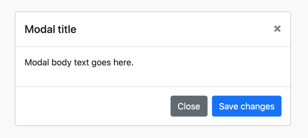
<!-- Bootstrap -->
<div class="modal" tabindex="-1" role="dialog">
<div class="modal-dialog">
<div class="modal-content">
<div class="modal-header">
<h5 class="modal-title">Modal title</h5>
<button type="button" class="close" data-dismiss="modal" aria-label="Close">
<span aria-hidden="true">×</span>
</button>
</div>
<div class="modal-body">
<p>Modal body text goes here.</p>
</div>
<div class="modal-footer">
<button type="button" class="btn btn-secondary" data-dismiss="modal">Close</button>
<button type="button" class="btn btn-primary">Save changes</button>
</div>
</div>
</div>
</div>
That’s a lot of markup! And there’s plenty of room for error with those aria attributes exposed.
Now let’s take a look at an equivalent Shoelace dialog.
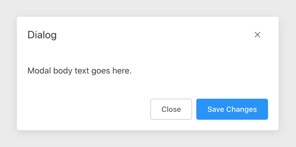
<!-- Shoelace -->
<sl-dialog label="Dialog">
  <h3 slot="header">Modal Title</h3>
  Modal body text goes here.
  <sl-button slot="footer">Close</sl-button>
  <sl-button slot="footer" type="primary">Save Changes</sl-button>
</sl-dialog>
That’s much easier to work with! And there’s less room for error since the component handles its aria attributes internally.
If you find this example inspiring, I encourage you to browse the Shoelace website and look at some more examples. I think you’ll be pleasantly surprised.
Why Use It?
At this point, you’re probably wondering what sets Shoelace apart from other component libraries. For one, it’s framework agnostic, meaning you can use it in React, Vue, Angular, and any other framework you throw at it. This is perfect for teams that want to use different frameworks with the same components for a consistent UX.
Since Shoelace components are Web Components, they’re built on standards that browsers have committed to supporting for a long time. As old frameworks age and new ones emerge, you won’t have to spend time rebuilding buttons, inputs, and other low-level components. Shoelace will just keep working.
If you prefer to use the platform and avoid frameworks altogether, that’s fine too. Shoelace works great with vanilla HTML+JS!
I almost forgot — Shoelace is open source and available under the MIT license, so it’s free to use and anyone can contribute to it!
Learn More
This was just a quick introduction to Shoelace 2.0 and Web Components. I hope you enjoyed the update.
If you’re interested in learning more about Shoelace, here are some links you’ll find useful!


About Cory LaViska
Cory LaViska is the founder of A Beautiful Site, LLC, a small development studio in New Hampshire. He’s responsible for Shoelace and Surreal CMS, as well as a handful of open source projects on GitHub.