User Interface (UI) design is the process designers use to create interfaces in computerized devices. Whilst UX design focuses on usability, UI’s primary focus is on making a site as aesthetically pleasing as possible.
An excellent UI is important because it facilitates the interactions between the user and the application. If a user can easily navigate their way around your application, they’re more likely to have a good experience.
The challenging part about this is that UI design principles are constantly changing and evolving. For this reason, adaptability, on top of the need to stay up to date with trends, is mandatory.
Below are the top UI trends to look out for in 2022.
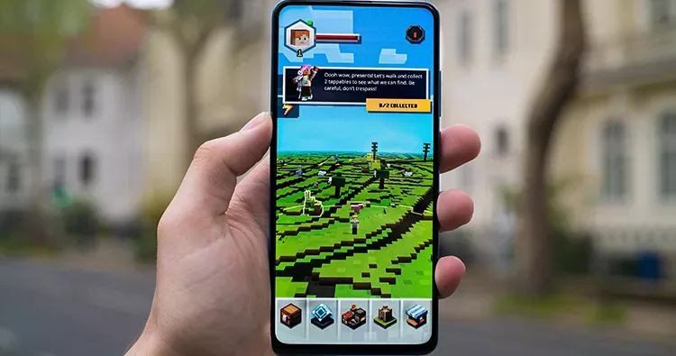
Augmented Reality (AR)
AR refers to computer-generated information shown over real-life objects across mobile devices. It benefits users by providing them with an extraordinary User Experience (UX).
Let’s look closely at how it benefits the user’s experience.
It introduces out-of-this-world interactive experiences - Users can experience magical and realistic worlds. Before, these experiences were just in dreams.
It presents a unique immersion to a new reality - AR allows users to experience new reality without jeopardizing their safety.
It entices users to take action - Users tend to respond positively to situations they find relatable. For example, they’re more attracted to buy products they can see with a 360-degree angle.
It provides safety technology - The automobile industry benefits from this the most. Examples of this are virtual windscreens.
Top examples of the use of AR are the world of Pokemon Go and Snapchat filters. When these programs first went to market, almost everyone all over the world went crazy. And with the excitement it brings to the world, it’s no surprise that its market will grow massively in size and reach about 300 billion by 2024.
Below are tips on how to incorporate AR in UI:
Design for safety - Don’t put people at risk. To do that, you need to consider physical constraints, minimize physical input, and communicate your program’s requirements.
Design for comfort - Prioritize user comfort and design your program in a way that allows users to move freely as they explore real-world environments.
Grant users an immersive experience - Present convincing illustrations with realistic audio. This will give users a memorable AR experience.
Offer guidance - Walk them through how to use your program. But avoid overwhelming them and providing them with an overload of information.
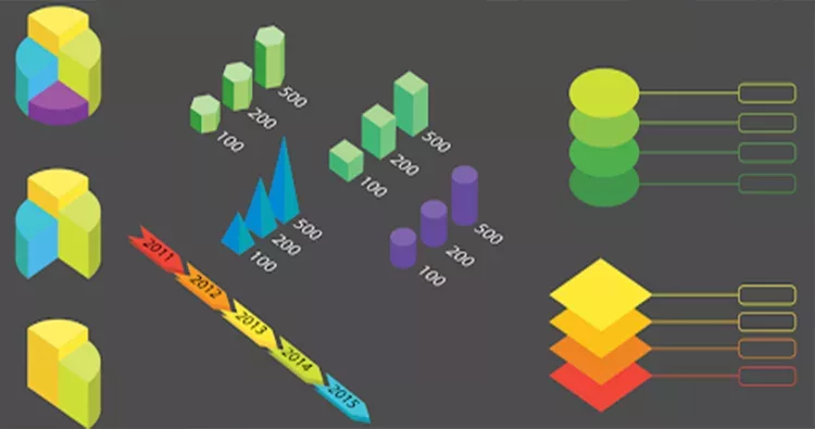
3D Elements
3D elements are elements that emphasize the three-dimensional aspect of an object. They include space, shape, volume, and color.
In many cases, 3D graphics have more benefits than standard images. Due to their photorealistic design, they steal a user’s attention.
Below is a discussion of their benefits.
They provide a more accessible design process - With 3D designs, designers can easily make changes and streamline a design process.
They simplify the presentation of physical prototypes - This allows users to evaluate products better before they receive an actual model.
They introduce futuristic vibes - For users who prefer to stare into the future, 3D designs are extremely appealing. They bring realism topped with an unmatched vibrancy to even the most mundane products. What’s better is that they can view the concept of these designs thoroughly.
They present accurate measurements - Users can know the feel of a product if it’s in 3D. They can analyze its exact height, length, base, and width.
Examples of brands that incorporate 3D elements and use 3D graphics are Kaspersky, Ordnance Survey, and Stripe.
Below are best practices for using 3D design.
Make simple designs - Don’t complicate your product. Use 3D design to complement what you already have.
Create highly interactive environments - Interactive elements adds entertainment to your whole dynamic. It steals the attention of the users, too.
Present a futuristic world - Demonstrate what it’s like to be in the future. As you emphasize the positive side of a new realm, remember to also be realistic.
Keep things accurate - Incorporate accuracy. This makes your product even more useful.
Split-Screen Design
Split-screen designs are designs that incorporate two (or more) screens in a bigger picture.
These designs are becoming more popular in 2022 because they’re so effective. Split-screen designs increase productivity with users being able to do multiple things at once.
Let’s check out the reason in a detailed manner.
They encourage users to make a choice immediately - For example, users can read and immerse themselves in an article on one side. Then they can instantly write a comment or share it with their network on the second screen.
They highlight vertical images - Vertical orientation creates depth. And users appreciate content with a profound sense.
They work so well with the responsive format - Most visuals created for split-screen designs tend to be highly responsive. This is a major deal because this means users can smoothly access your site regardless of their screen sizes.
They play on contrasts - Contrasts help organize your site’s design. They also create hierarchy and allow you to show the parts that are more important.
Mix vibrancy and drama - Use a vibrant color (like neon blue) and dramatic typography to enhance the text content. It creates harmony and adds interest.
Use animation - Adding interactive effects to your content encourages users to take action. It also adds fun and personality to the environment.
Emphasize the CTA (Call to Action) button - Make your CTA button a focal point. And allow the other elements of your landing page to support the CTA.
Create a visual flow - Establish a connection between the split screens. A common way to do this is to feature a color that appears on both screens.
Storytelling
Storytelling is the ability to control a narrative. Effective storytelling is how you captivate audiences — get insights and establish empathy — in a way that encourages them to take action.
The power of storytelling is becoming so popular because it works in line with a person’s nature. Humans are wired to identify patterns. And this essentially helps them form the basis of their curiosity.
Below are more of the benefits of storytelling.
They help persuade and influence - Consider the action you want users to take and gently guide them into doing it.
They help communicate - Especially if there are language barriers, it can be challenging to get your message across. Add a relatable story into the mix, and you can speak to them with confidence and clarity.
They add logic - A common reason people don’t buy into a product is that they can’t understand how it can make sense. With an excellent story, though, you can change this.
They bring value - In addition to adding logic, stories bring value to situations by making them more. They make your offer unique, and make users appreciate them better.,
To view examples of excellent storytelling, check out Tapbots and Bellroy.
Here are tips for nailing the storytelling trend.
Use personas - This lets you define your target audience and helps them envision themselves as a vital part of a story. In turn, this provides you with empathic insights.
Create an exceptional plot - Make your target audience heroes. Include a challenge, too, to overcome the challenge and encourage them to go through your entire story.
Provide a supporting role - Put a useful element that your target audience can turn to to help them overcome a challenge. Not only will this make users feel confident in achieving their goal, but this will also make your story relatable.
Tailor the theme well - Strategically choose layouts, colors, and font sizes and styles. The idea is to evoke strong emotions and build empathy by designing an aesthetically pleasing theme.
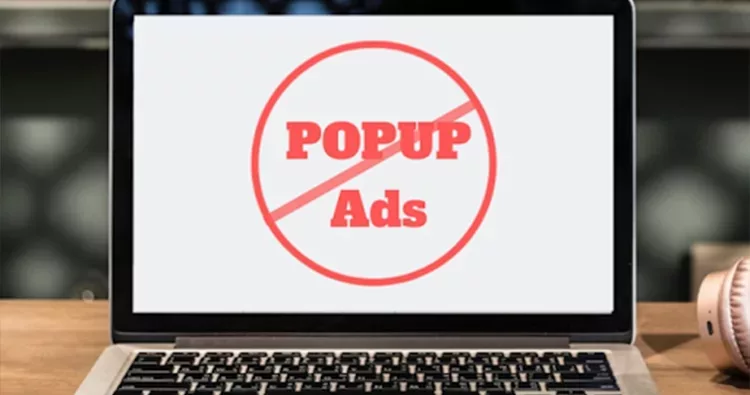
Micro Interactions
Micro-interactions refer to trigger-feedback pairs that involve a user action and a targeted response. These pairs are communicated via small, contextual changes in UI.
It’s good practice to take advantage of the micro-interactions trend when your site is due for a much-needed revamp.
Here are the benefits of using micro-interactions:
They make your site memorable - Subconsciously, users tend to remember these little details compared to the other site features.
They create a (more) organized structure - For example, you can hide lists rather than show them and show a load of information users might not even want to see. In case they want to see these lists, they can simply click a pull-down menu that can display a list they want to load.
They improve site navigation - If users don’t know how to get from one portion of your site to another, they might exit your site. But if a window pops up and offers to instantly take them to their destination, they can simply get there and be loaded with the information they want. This is incredibly important when it comes to building a website that converts visitors.
They bring excitement to your site - Compared to a site with no micro-interactions or ones filled with static pages, your site is more fun to visit. This gives users a positive experience and motivates them to visit again.
The most common examples are pop-ups that ask users to sign in (or register). When a user takes an actionable step prompted by a pop-up on your site, they interact with you in a small (or micro) way.
Below are tips for implementing micro-interactions.
Make them simple - Include nothing but the most essential element. And let your intention be to make the lives of users easy.
Design for purpose - Be clear about what a specific micro-interaction needs to do — what is its relevance to your users and your site? Then create it in a way that delivers this message.
Analyze and improve - Regularly ask for feedback about your process and take into account all the criticisms. Be sure to use the criticisms constructively, too.
Don’t add fancy animation - Animation may bring life and entertainment to the micro-interactions. But they can introduce unnecessary distractions and complicate your product.
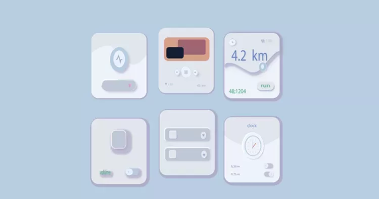
Neumorphism UI
Neumorphism, also called soft UI, is a style that emphasizes the detailed graphics of buttons and switches.
Below are the pros of using neumorphism.
Visual freshness - It makes your site look “breathable” and user-friendly.
Allows mixing of different styles - You can use a minimal background and combine it with retro and colorful elements. This can also be achieved without compromising the look of your website.
Meanwhile, here are the cons.
Discourages intuitiveness - While it makes your site easy to understand, it also makes it ordinary. For some people, it’s boring and not worth their time.
Lacks contrast - The buttons and corners featured all over your site are in almost the same color. This makes your site plain and prevents you from highlighting some elements.
Examples of common neuromorphic designs are apps for music players and fitness devices.
Below are tips for implementing neumorphism in UI.
Use neumorphic designs sparingly - Avoid overusing gradient and shadow styles. The idea is to make some portions of your site stand out — not the design itself.
Allow accessibility - Neumorphic designs are heavily criticized for their terrible accessibility. But you could always use moving effects or animation to resolve the problem. For example, animate a button’s hover interaction to communicate it’s a button.
Integrate illustrations - Use illustrations instead of photographs. This lets you create a consistent look considering neumorphism gives the feel of a 3D illusion.
Present cross-platform designs - Let users access your site regardless of the device they’re using. So design for desktop, tablets, and mobile phones.
Conclusion
AR, 3D elements, split-screen design, micro-interactions, storytelling, and neumorphism are UI trends that can enhance the user experience of your application. That’s why you might want to consider jumping on them and reorganizing your business.
Although updating elements of your business might be challenging, it is one of the best ways to stay up to date and focus on growth. Remember, changes are constant. To continue being effective in your industry, adapting to changing times is essential.
SHARE THIS BLOG ON
Other Posts
STAY UP-TO-DATE WITH US
Subscribe to our newsletter and know all that’s happening at Cabot.