
AI Insights and Visuals
AI has been evolving in many sectors of technology, and the same is being implemented in Power BI to a very good extent. In 2019, there were enhancements in Power BI where more powerful AI features were included, like AI visuals, Text analytics, the inclusion of Azure machine learning models, Image recognition, which plays an important role in advanced analytics, quicker insights from data models, an automatic Q&A system, and more. In Power BI, there are various sections with AI features and capabilities.
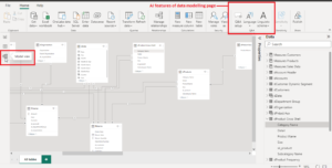
As we know that Power BI work role is divided into 3 parts, which involve Data Preparation, Data modelling, and Data visualization, and each consists of some AI features or insights:
- Data Visualization: Consists of 4 visuals having AI capabilities: Key Influencers, Q&A Visual, Smart Narrative, and Decomposition Tree.
- Data Preparation: AI Insights Section: Text Analytics, Vision, and Azure Machine Learning
- Data Modelling: Q & A Section, Q & A Setup, Language, Linguistic Schema
Now let’s start with the visual section:
- Key Influencer Visual
- Q & A Visual
- Smart Narrative
- Decomposition Tree Visual
These visuals can be selected from the Insert tab and the Visualization tab of the Power BI desktop.
KEY INFLUENCER VISUAL
- Key Influencer uses the concept of machine learning for analysing the data and provides useful insights about the key factors that are impacting the selected field or metrics that we want to analyse, along with a visual representation.
- Helps in determining how the factors affect the selected metrics that we are analysing. For example, In the image, we are analysing the Gross sales, so here this visual helps to find out how the gross sales are affected by the factors, that is, when they get lower or higher.
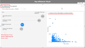
There are two main tabs in the visual: Key influencers and Top segments.
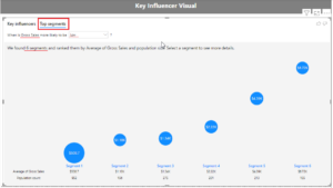
Top Segments Tab
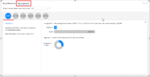
The Top Segments tab provides a detailed view of any segments that Power BI has identified for the metrics. A segment is simply the combination of the factors that affect the metrics that we are analyzing. The bigger the circle, the greater its impact, and after clicking those bubbles, a new page gets opened where we can observe more details about the factors (refer to the below image). It will drill down into the data and give you the details of that segment.
Q & A VISUAL
- The Q&A visual used in Power BI to create visuals uses the concept of natural language processing to interpret questions and give answers from the data. It simply asks the questions and gets the appropriate answer related to them with visual insights.
- It is similar to Smart Narrative Visual, but in addition to text output, it gives results in a visual format, and we can also convert the results into standard visual.
- With the help of Q&A visuals, we can ask a variety of questions, such as: Returning the top N products; providing a filter; condition-based scenarios; date filtering; returning a specific visual; using complex aggregations; sorting results; comparing data; and viewing trends or insights from the data.
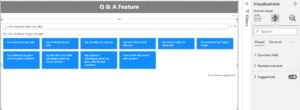
The above figure shows a Q&A visual where automatic suggestions are created for gaining insights.

The Future of Big Data
With some guidance, you can craft a data platform that is right for your organization’s needs and gets the most return from your data capital.
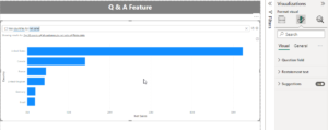
Figure: We have asked the question “top countries by net sales,” where the visual generates automatic output in the form of a chart for showing insights.
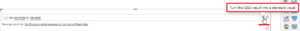
This option helps in converting the desired output into a standard visual. We can use this feature once we are satisfied with the solution and it matches the requirement, after which we can convert to standard visual.
This option opens up the Q & A setup menu for more in-depth configuration required, like review questions and managing the terms that have been set. It ultimately opens up the below window:
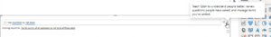
This window has full-fledged settings required for changes or updates required in the Q&A. Here we can set the questions, review them, search for suggestions, and manage the terms that we have added.
DECOMPOSITION TREE
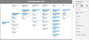
- This is a highly interactive visual that allows you to decompose (break down) a measure by various attributes across different dimensions. This visual is used to perform root-cause analysis and understand your data in a detailed manner, which is enhanced by the built-in AI functionality.
- This AI visual breaks down a specific field or value into its sub-sections and gives data in a hierarchical manner, like a tree structure. It helps in revealing the relationships between different parameters of the business.
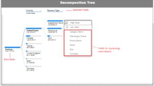
In the above image, we can observe that by expanding the +’ icon, we can go into in-depth details of the root node, like here we have a countries list, then in selected countries there are stores, and after that protein details, so it’s kind of a hierarchy-based analysis where in-depth insights can be taken out of the data model.
SMART NARRATIVE
- Smart Narrative is an important AI visual that helps in getting a quick explanation and key insights about the visual or report page in textual format. It is best suited for finding out a quick summary of the report.
- It is dynamic in nature that is content gets updated after any changes in the visuals or after filtering. It also gives you the freedom to update any text or add some key points about the visuals.
- Two methods: 1) creating a word-based narrative based on just a single visual, like a summarise option. 2) Create a full narrative, or we can say summaries, for all valid visuals on a dashboard.
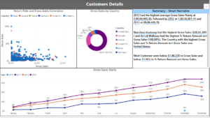
Figure – “Summary: Smart Narrative” shows all the key points gathered from the scatter, line and doughnut chart displaying on the page. It has summarized the key aspects of all the visuals and presented them in text format.
Note: Although it is dynamic in nature, any changes made to the data will not reflect in the visual.
Smart narrative not implemented in : KPIs, Tables, matrices, cards, and some custom visuals.
Power Query AI insights:
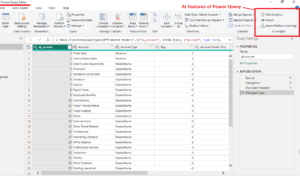
- Text Analytics: Text analysis (Detect language, Score sentiment, Key phrases)
- Vision: Tagging images, Image Analytics
- Azure Machine learning: It allows the use of Azure ML models.
Data Modelling Q & A:
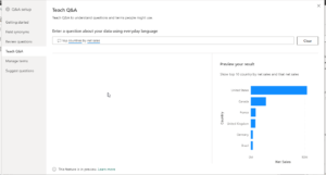
- Q & A setup: Teach to understand, review questions, and manage the terms you have added.
- Language: Changing the language of the questions asked in the Q&A
- Linguistic Schema: Import or export the file containing important information. Q & A uses the dataset and the custom terms you have taught it to understand.
Note: To use the AI insights feature, it requires a Power BI Premium subscription. If you enable the Power BI Pro time trial, you can test and learn about this feature.
Limitations:
- In some conditions where there is too large and complex data, there might be a slight variation in the visual’s output.
- If there are changes in the data, they don’t reflect in some visuals, as we have seen in the Smart Narrative.
- Next point is regarding data security, which revolves around the use of AI-based visuals.
- Q&A visual works best when your data is fully prepared, with all fields in accurate language. If your fields are not fixed or has lot of variation the creating a Q&A visual is trickier to use in such cases.
So, this was about the first part of the Power BI features blog, where we have seen how AI plays a vital role in Power BI, like in the functioning of the visuals section, power queries, and the data modelling part.
Thank You!
Happy Reading!