The process of creating a Power BI executive dashboard is like peeling the forbidden fruit of facts that can transform your business process and give a fuller view when making decisions for your organization. They become the clear and transparent view for your business, allowing the analysis of the state of affairs from different perspectives and with the aid of various indicators. Closely linked to Power BI, Power BI analytics is the most powerful and efficient tool that enables you to not only view data but also uncover trends, identify opportunities, and model your organization to become more effective and successful.
The essence of crucial indicators that ensure optimal performance of executive dashboards is discussed in this blog, as it shows how they can be used to elevate an organization above competitors. All you need to know is that it is about developing an executive dashboard that applies to finance, healthcare, industrial processes, and basically all other industries. Jump with us the essential knowledge of Power BI dashboard development services and then see how they are going to reshape your understanding of the data-based decision-making process.
Key Metrics for Your Power BI Executive Dashboard
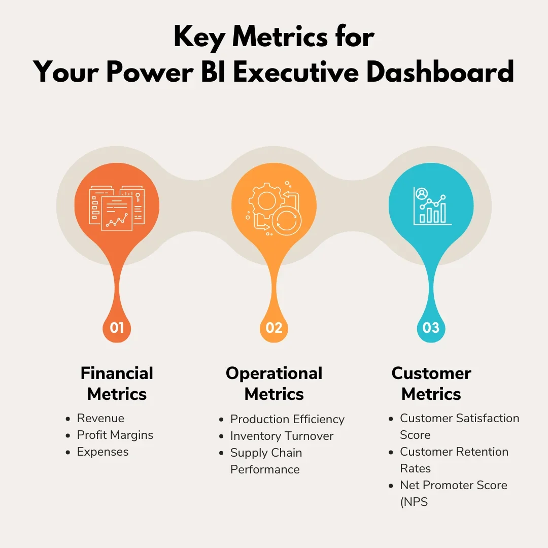
The starting point of any executive dashboard in Power BI is to identify and highlight the metrics that truly drive your business. Understanding which key performance indicators (KPIs) are pivotal to organizational success is the first step in creating an effective tool for decision-makers. For most organizations, these key metrics can be divided into three broad categories.
1. Financial Metrics
When it comes to providing detailed information on a business’s operational efficiency and financial health, financial metrics are the foundation of executive decision-making. These metrics comprise a variety of essential indications that assist executives in determining the organization’s financial condition, formulating strategic plans, and fostering expansion. The following are the main financial metrics:
- Revenue: Revenue is the total income generated from sales of goods or services during a specific period. It is a fundamental indicator of a company’s financial performance and growth.
- Profit Margins: Profit margins indicate the percentage of revenue that exceeds the costs associated with generating that revenue. Higher profit margins indicate better efficiency and profitability.
- Expenses: Expenses encompass all costs incurred in the process of generating revenue, including operational, administrative, and other expenses.
2. Operational Metrics
Operational metrics give refined information about an organization’s efficiency and effectiveness in executing its operational processes. They offer invaluable insights into the performance of key areas such as production, supply chain, and overall operational management. These metrics, when properly tracked and analyzed, can help identify areas for improvement, optimize resource allocation, and enhance overall operational performance.
- Production Efficiency: Production efficiency measures the ratio of output to input in the production process, indicating how well resources are utilized.
- Inventory Turnover: Inventory turnover is the number of times inventory is sold or used in a given period, showing how efficiently inventory is managed.
- Supply Chain Performance: Supply chain performance measures the effectiveness and efficiency of the entire supply chain, from raw material sourcing to delivery of the final product.
3. Customer Metrics
Customer metrics give a clear picture and invaluable insights into customer behavior and preferences which helps to enhance customer satisfaction and loyalty. By leveraging these metrics, organizations can tailor their products and services to meet customer expectations more effectively, ultimately driving customer retention and loyalty.
- Customer Satisfaction Scores: Customer satisfaction scores measure the degree of satisfaction customers have with a company’s products or services.
- Customer Retention Rates: Customer retention rates indicate the percentage of customers that continue to do business with a company over a specific period.
- Net Promoter Score (NPS): Net Promoter Score measures customer loyalty and satisfaction based on the likelihood of customers recommending a company to others.
Types of Power BI Executive Dashboards
Power BI Executive dashboards are instrumental tools for modern businesses, offering a comprehensive view of key performance indicators (KPIs) and critical metrics. They enable stakeholders to make informed decisions, drive growth, and optimize operations. Here is a more detailed look at the types of Power BI Executive Dashboards:
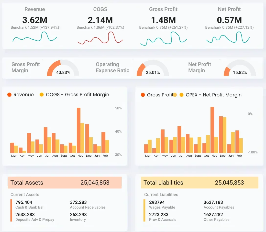
1. Financial Performance Dashboard
This dashboard shows a detailed analysis of the company’s financial health, offering insights into revenue trends, profitability, and cash flow. It includes KPIs such as gross profit margin, net profit margin, return on investment (ROI), and financial ratios. The dashboard also compares actual financial performance against budgeted targets, highlighting areas of concern or success and enabling stakeholders to make data-driven decisions to improve financial performance.
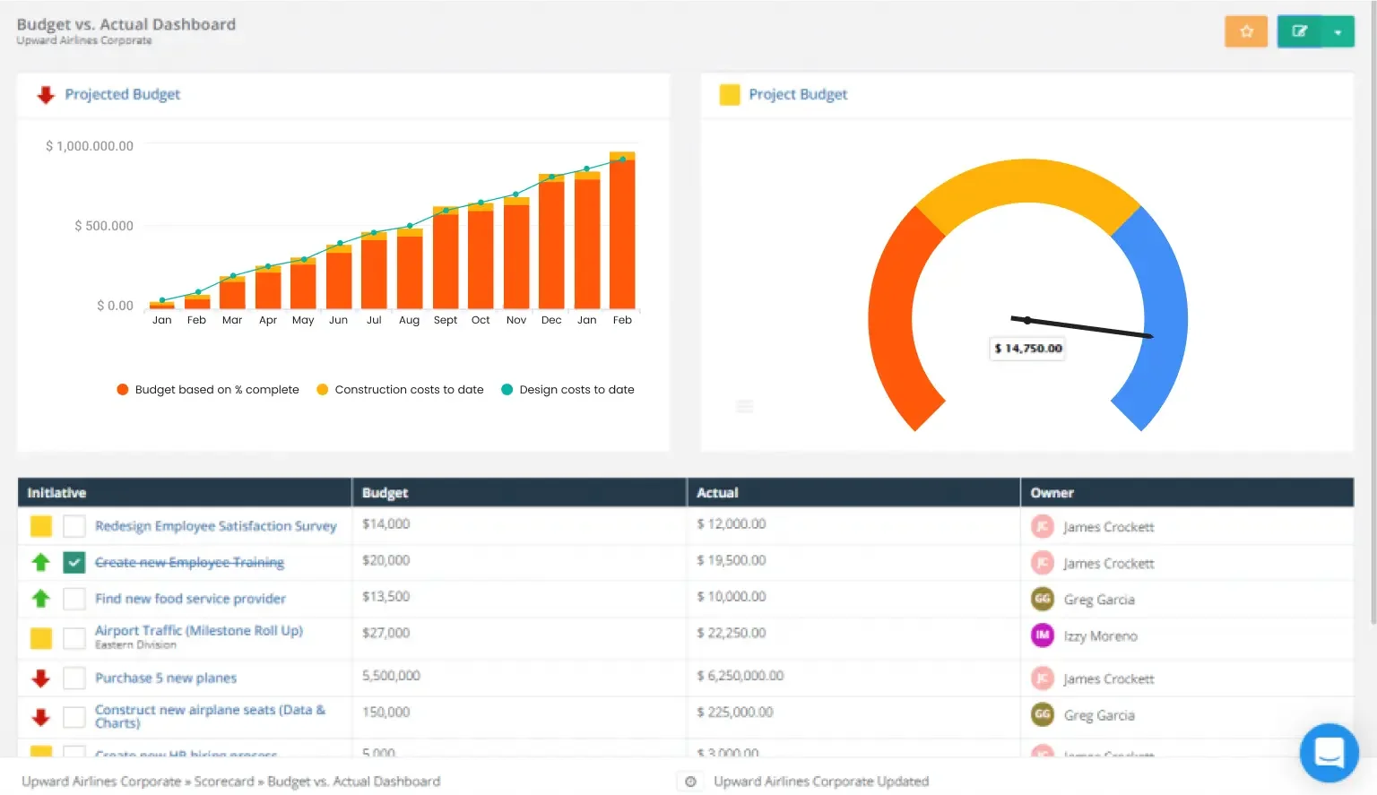
2. Expense Reporting Actual vs Budget Dashboard
This dashboard compares actual expenses to budgeted amounts, helping stakeholders identify variances and manage costs effectively. It includes visualizations such as a line chart, bar chart, line graph, and pie chart to present data in an easily understandable format. The dashboard enables stakeholders to track spending patterns, identify areas for cost reduction, and improve budgeting accuracy.
3. CEO Dashboard
The CEO dashboard provides a high-level overview of the company’s overall performance, focusing on KPIs related to revenue growth, market share, and strategic initiatives. It includes visual elements such as trend lines, heat maps, and scatter plots to highlight key trends and insights. The dashboard enables CEOs to monitor the company’s performance in real-time, identify growth opportunities, and make informed strategic decisions.
4. CFO Dashboard
The CFO dashboard focuses on financial metrics that are critical to the Chief Financial Officer, such as cash flow projections, working capital ratios, and financial ratios. It includes visualizations such as waterfall charts, financial statements, and variance analysis reports to provide a comprehensive view of the company’s financial health. The dashboard enables CFOs to monitor financial performance, identify areas for improvement, and communicate financial insights to stakeholders.
5. Project Performance Dashboard (PMO and Capital)
This dashboard tracks the performance of projects managed by the Project Management Office (PMO) or capital projects. It includes metrics such as project timeline, budget variance, resource utilization, and project risks. The dashboard enables project managers and stakeholders to monitor project progress, identify issues early, and take corrective actions to ensure project success.
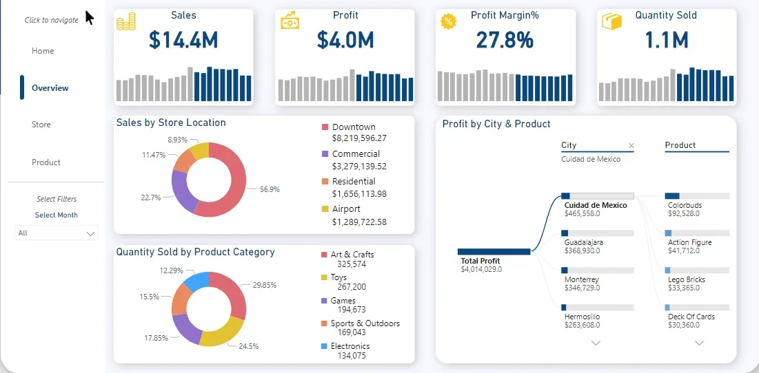
6. Sales Performance Dashboard
The sales performance dashboard shows profound insights into sales metrics such as revenue, sales pipeline, conversion rates, and sales team performance. It includes visualizations such as sales trend charts, customer segmentation analysis, and sales forecast reports to help stakeholders understand product sales performance. The dashboard enables sales representatives and teams to track progress toward sales targets, identify sales trends, and make informed decisions to drive revenue growth.
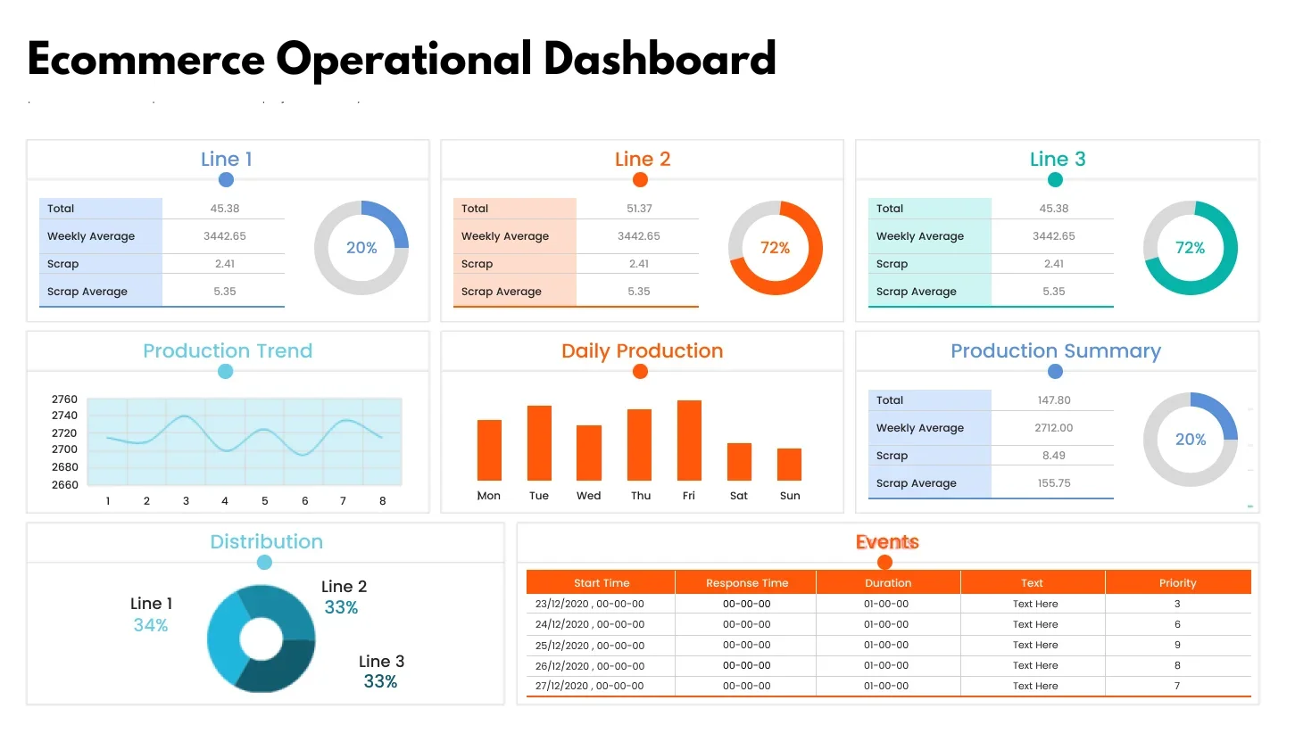
7. Operational Performance/Management Dashboard
This dashboard focuses on operational metrics that are crucial for day-to-day management, such as production efficiency, inventory management, and supply chain performance. It includes visualizations such as heat maps, gauge charts, and process flow diagrams to help stakeholders monitor operational performance. The dashboard enables operations managers to identify bottlenecks, optimize processes, and improve overall operational efficiency.
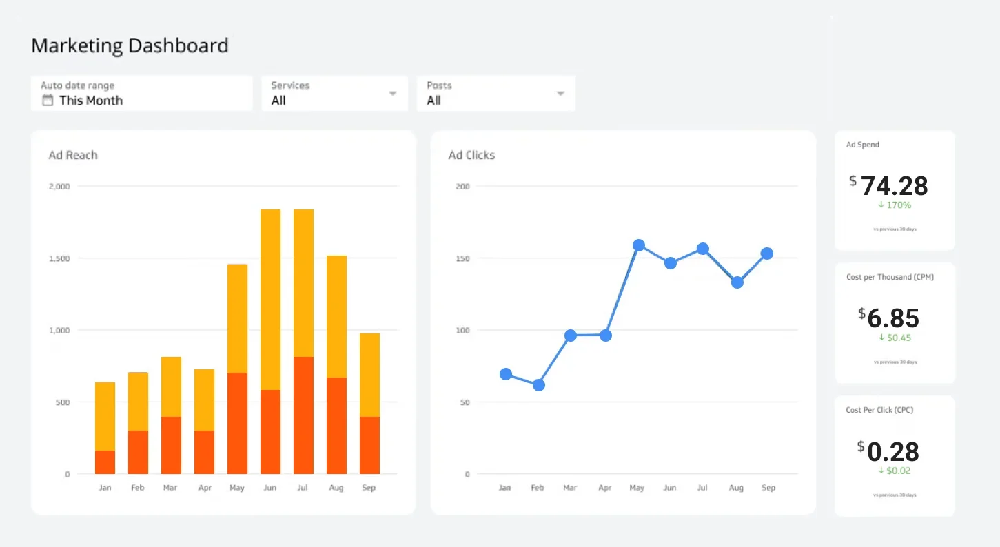
8. Marketing Performance Dashboard
The marketing performance dashboard tracks the effectiveness of marketing campaigns and initiatives, including ROI, customer acquisition cost (CAC), and customer lifetime value (CLV). It includes visualizations such as campaign ROI analysis, customer segmentation reports, and marketing channel performance metrics. The dashboard enables marketing managers and teams to evaluate the performance of marketing strategies, allocate resources effectively, and optimize marketing campaigns for better results.
10. CIO Dashboard
The CIO dashboard focuses on IT metrics that are critical to the Chief Information Officer, such as IT infrastructure performance, cybersecurity metrics, and system uptime. It includes visualizations such as network performance dashboards, cybersecurity threat analysis reports, and IT service desk performance metrics. The dashboard enables CIOs to monitor IT operations, identify potential security threats, and ensure the smooth functioning of IT systems.
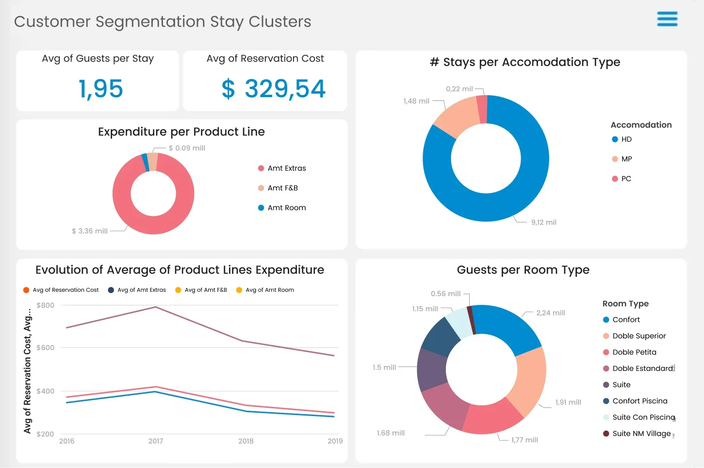
9. CRM Dashboard
Through CRM dashboard a Power BI developer provides insights into customer relationship management (CRM) activities, including customer acquisition rate, customer retention rate, and customer satisfaction scores. It includes visualizations such as customer churn analysis, customer lifetime value (CLV) charts, and customer segmentation reports. The dashboard enables CRM managers to track customer interactions, identify valuable customers, and improve customer relationships.
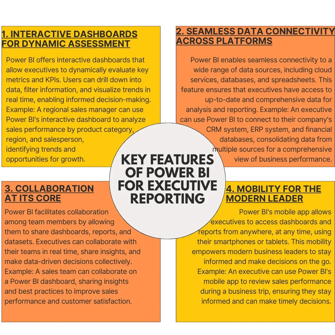
Key Features of Power BI for Executive Reporting
By offering a strong platform that efficiently displays your company data, Power BI outperforms conventional reporting solutions. Its adaptability enables smooth integration with different data sources, interactive displays, and thorough data analytics. Let’s examine its exceptional characteristics along with some Power BI dashboard examples that support the creation of insightful executive dashboards personalized to your business needs.
Power Up Your Business Intelligence with Power BI
Turn complexity into clarity with our user-friendly Power BI solutions.
Best Practices for Designing an Effective Executive Dashboard with Power BI
Executive dashboards are essential tools that offer a comprehensive view of an organization’s performance, enabling informed decision-making at the executive level. Designing an effective executive dashboard with Microsoft Power BI involves several critical considerations to ensure its functionality, usability, and relevance. Explore the best practices for creating a successful executive dashboard, focusing on key areas such as KPI selection, user experience, data security, and maintenance.
1. Focus on KPIs That Matter
The first step in designing an effective executive dashboard is to identify the most critical KPIs that align with your organization’s strategic goals. These KPIs should be selected based on their relevance and impact on decision-making. Once identified, prioritize these KPIs to ensure that the most important metrics are prominently displayed on the dashboard, making it easier for users to quickly assess performance and make informed decisions.
2. User Experience is Priority One
A key aspect of a successful executive dashboard is its user experience (UX). Design the dashboard to be intuitive and user-friendly, with clear and concise visualizations that allow users to quickly understand the data. Incorporate interactive features such as filters and drill-downs to enable users to explore the data further and gain deeper insights.
3. Data Security and Integrity
Data security and integrity are paramount when designing an executive dashboard. Implement robust security measures to protect sensitive data, such as customer information or financial data. Utilize Power BI’s security features, such as row-level security and encryption, to ensure data confidentiality and integrity.
4. Optimize for Performance
To ensure optimal performance, continuously monitor the dashboard’s performance metrics and proactively address any bottlenecks or inefficiencies. Optimize data refresh schedules and query performance to minimize latency and ensure real-time data availability. Employ caching mechanisms and data compression techniques to enhance dashboard responsiveness, particularly when dealing with large datasets. Regularly conduct performance testing to identify areas for improvement and fine-tune system configurations accordingly.
5. Provide Context and Insights
Contextualizing data is essential for facilitating informed decision-making. Enhance the dashboard’s usability by providing descriptive context and explanations for each KPI displayed. Incorporate textual annotations, tooltips, and contextual filters to provide additional context and insights into the underlying data trends and patterns. Leverage data visualizations such as trend lines, sparklines, and comparative analyses to highlight key insights and facilitate data-driven decision-making.
6. Regularly Review and Update
The dynamic nature of business demands continuous review and refinement of the executive dashboard. Regularly solicit feedback from end-users and stakeholders to identify areas for improvement and enhancement. Conduct periodic reviews to assess the dashboard’s performance, relevance, and alignment with evolving business objectives. Proactively incorporate user feedback and emerging best practices into dashboard design iterations to ensure its ongoing effectiveness and value delivery.
Examples of Power BI Executive Dashboards
Power BI Executive Dashboards revolutionize data visualization, offering a dynamic lens into an organization’s key performance indicators (KPIs) and metrics. These cutting-edge tools empower executives with actionable insights, presented in visually engaging formats, fostering informed decision-making. Explore below how various industries leverage Power BI Executive Dashboards to drive efficiency and achieve strategic objectives.
1. Finance
- KPIs: Revenue, Profit Margins, Return on Investment (ROI), Cash Flow
- Dashboard Features: Trends in Revenue and Profit, Budget vs. Actual Analysis, Cash Flow Forecasting, ROI Analysis
- Use Case: A financial services company uses a Power BI Executive Dashboard to track its financial performance in real-time, allowing executives to identify trends and make strategic decisions to improve profitability.
2. Healthcare:
- KPIs: Patient Satisfaction, Average Length of Stay, Bed Occupancy Rate, Revenue per Patient
- Dashboard Features: Patient Satisfaction Scores, Average Length of Stay Trends, Bed Occupancy Rates by Department, Revenue Analysis
- Use Case: A hospital uses a Power BI Executive Dashboard to monitor patient satisfaction levels and operational efficiency, enabling executives to allocate resources effectively and improve patient care.
3. Manufacturing:
- KPIs: Production Efficiency, Defect Rate, Inventory Turnover, OEE (Overall Equipment Effectiveness)
- Dashboard Features: Production Efficiency Metrics, Defect Rate Trends, Inventory Turnover Analysis, OEE Calculation
- Use Case: A manufacturing company uses a Power BI Executive Dashboard to optimize production processes and minimize downtime, leading to increased productivity and profitability.
4. Retail:
- KPIs: Sales Performance, Inventory Levels, Customer Acquisition Cost, Average Transaction Value
- Dashboard Features: Sales Trends, Inventory Analysis, Customer Acquisition Analysis, Average Transaction Value Trends
- Use Case: A retail chain uses a Power BI Executive Dashboard to track sales performance across stores, optimize inventory levels, and improve marketing strategies to increase customer acquisition and retention.
5. Education:
- KPIs: Student Enrollment, Retention Rate, Graduation Rate, Academic Performance
- Dashboard Features: Enrollment Trends, Retention Rate Analysis, Graduation Rate Trends, Academic Performance Metrics
- Use Case: A university uses a Power BI Executive Dashboard to monitor student enrollment and academic performance, enabling administrators to make data-driven decisions to improve student outcomes.
6. Technology:
- KPIs: Product Adoption Rate, Customer Satisfaction, Churn Rate, Revenue Growth
- Dashboard Features: Product Adoption Trends, Customer Satisfaction Scores, Churn Rate Analysis, Revenue Growth Analysis
- Use Case: A software company uses a Power BI Executive Dashboard to track product adoption, customer satisfaction, and revenue growth, allowing executives to prioritize product development and customer retention efforts.
7. Hospitality:
- KPIs: Occupancy Rate, RevPAR (Revenue per Available Room), Average Daily Rate (ADR), Customer Feedback Scores
- Dashboard Features: Occupancy Rate Trends, RevPAR Analysis, ADR Trends, Customer Feedback Analysis
- Use Case: A hotel chain uses a Power BI Executive Dashboard to optimize room occupancy, pricing strategies, and customer service initiatives, leading to increased revenue and customer satisfaction.
Benefits of Using Power BI for Executive Dashboards
The value of Power BI dashboards extends far beyond their attractive design. These tools are essential strategic assets for executives, enabling agility, offering insights into trends, and facilitating confident decision-making. By leveraging these dashboard insights, leaders can guide their organizations toward data-driven strategies, ensuring long-term success and adaptability in a constantly evolving business environment.
1. Data Visualization that Speaks Volumes
Power BI is renowned for its ability to transform raw data into visually compelling and insightful charts, graphs, and reports. Its intuitive interface empowers executives to easily interpret complex data, identify trends, patterns, and outliers, and communicate their findings effectively to stakeholders. This visual representation of data not only simplifies understanding but also fosters collaboration and alignment across teams.
2. Real-Time Insights for Rapid Response
One of the standout features of Microsoft Power BI is its real-time data updates, which are invaluable for executives who need to make decisions quickly. By providing access to up-to-the-minute information, Power BI enables executives to respond promptly to changing market conditions, customer preferences, and emerging trends. This agility is a key differentiator in today’s fast-paced business environment, allowing organizations to seize opportunities and mitigate risks effectively.
3. A Beacon of Support for Decision-Making
Power BI dashboard offers executives a comprehensive view of their organization’s performance metrics through a centralized dashboard. This holistic view enables executives to track progress toward goals, identify areas for improvement, and make data-driven decisions that drive business growth. Furthermore, Power BI’s integration with other Microsoft tools, such as Excel and Azure, streamlines decision-making processes by leveraging existing data sources and workflows.
4. Craft a Perfect Fit with Customization
Power BI’s customizable features allow executives to tailor their dashboards to meet specific business needs. Whether it’s adding new data sources, creating custom visuals, or implementing advanced data analytics, Power BI provides executives with the flexibility to design a dashboard that aligns with their organization’s goals and objectives. This customization not only enhances the usability of the dashboard but also ensures that executives have access to the most relevant and impactful data for decision-making.
Conclusion
Through consistency and ease of use, we are able to conclude that Power BI executive dashboards are more than just figures as they present information visually. They provide tools to the executive that help them to understand the business complexity of today’s environment in order to work efficiently and be confident. With the emphasis on the main indicators and the use of Power BI to derive rich insights, institutions attain growth, innovation, and sharp strategic orientation that follow as consequences.
One way or another, whether you report the financial outcomes, optimize operations, or use data for customer satisfaction, Power BI dashboard development brings you to the high decision-making level to make changes that move the organization in the right direction. In your dashboard design, remember those numbers with colors are not the end point as the actual value comes from the ability to extract the actionable insights. Now, when Power BI is a tour companion, the opportunities are limitless and the route to success is more of a fun ride rather than a hike with a slippery, rocky surface.
Sunflower Lab has a team of the best Power BI experts and has helped many businesses simplify their workflow with the help of visually appealing Power BI dashboard development services. To make your business soar to new heights contact us for the best Power BI development services.
Our Power BI Solutions
Drive Success with Our Tech Expertise
Unlock the potential of your business with our range of tech solutions. From RPA to data analytics and AI/ML services, we offer tailored expertise to drive success. Explore innovation, optimize efficiency, and shape the future of your business. Connect with us today and take the first step towards transformative growth.
You might also like
Stay ahead in tech with Sunflower Lab’s curated blogs, sorted by technology type. From AI to Digital Products, explore cutting-edge developments in our insightful, categorized collection. Dive in and stay informed about the ever-evolving digital landscape with Sunflower Lab.