
Managing the structure and styling of components in web development may frequently become complex, particularly when working on large-scale projects with several developers or integrating third-party components. Because CSS is global, there is a chance for CSS conflicts and accidental styling changes, a common issue for developers.
Here’s where the Shadow DOM comes in as a problem-solving tool:
What is Shadow DOM?
Shadow DOM serves as an effective safeguard for web components. It encapsulates their styles and structure, preventing them from messing with the rest of the webpage. It’s a way to create independent components that don’t conflict with global styles, making your code more modular and reusable. Consider it granting each component its own personal space to perform its tasks.
Creating Shadow DOM: A Step-by-Step Guide
Let’s see a simple code example and learn how to use shadow DOM to create custom elements by creating a simple Login Form.
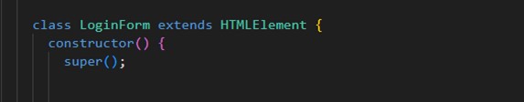
So, to create a custom element, first, we must create a class that should extend from the HTML element class.
We will add a constructor and call the super function. If we don’t call the super function, then this class’s ‘this’ keyword will not be initialized.
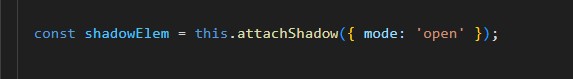
Now, let’s create a shadow element by using the attachShadow method. In this method, we need to provide an object with the mode value; it can be either open or closed.
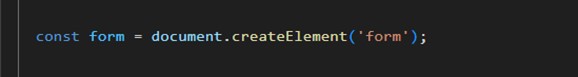
Create a root element ‘form‘ by calling document.createElement, and the reference will be stored in the form variable.
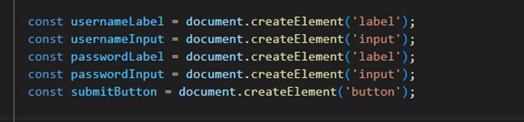
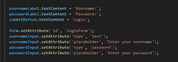
Now, let’s create the labels and inputs for the Username and Password, as well as the button for the Submit form.
Next, we’ll add text to the labels and button using the ‘textContent‘ property and set the ‘types‘ and ‘placeholder‘ attributes for the form and its inputs using the ‘setAttribute‘ method.

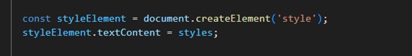
Applying styles to the Shadow DOM.
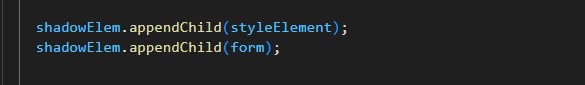
Let’s start to append form and its elements to the Shadow DOM
These two lines will append the ‘<style>’ element containing the styles specific to the login form, and the form element, which serves as the container for the login form components, is appended to the Shadow DOM.
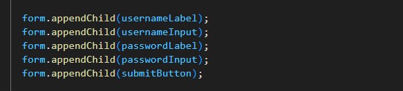
The elements usernameLabel, usernameInput, passwordLabel, passwordInput, and submitButton are appended to the form element within the Shadow DOM, composing the login form.
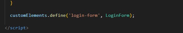
Here, we’re registering the ‘LoginForm‘ class as a custom element named ‘login-form.’ This enables us to utilize the ‘<login-form></login-form>‘ tag within our HTML document to instantiate instances of the login form component.
This is the outcome of our customized login form, which shows the UI of the login form on the left and its code structure on the right.
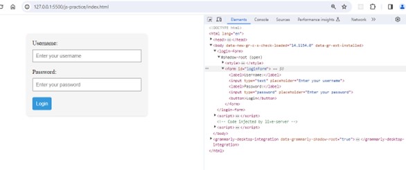
Understanding the Shadow DOM elements
- <login-form> is the custom HTML element defined in the code using customElements.define().
- #shadow-root (open) indicates the presence of a Shadow DOM for the <login-form> element, which encapsulates its internal structure and styling.
- Inside Shadow Element, there’s <style> element, which contains CSS style specific to the login form.
- The < form> element contains input fields for username and password and a submit button. This is also part of the Shadow DOM.
Shadow DOM Components
Shadow DOM components maintain their own styles and structures, like segmented bubbles within a webpage. They encourage modularity, which keeps global styles from influencing one another. Consider them as independent components that follow their own set of guidelines, improving the maintainability and reusability of the code.
How Does Styling Work Within the Shadow DOM?
Styles defined within the Shadow DOM remain contained within the scope of the component, thus ensuring encapsulation. They don’t affect other sections of the page.
Styles are basically individual instructions for every element. In the above example, the Login form component’s styles are unique to that form alone. It ensures a personalized look without interfering with the rest of the website, much like providing each piece its own set of guidelines.
Benefits of Encapsulation and Isolation
The ability to provide encapsulation and isolation has several significant benefits for building modular and maintainable code:
-
Modularity and Reusability
The Shadow DOM-encapsulated components function as modular construction blocks. Their reuse in different areas of a project or across multiple projects can contribute to the optimization and grading of the code base and its scalability.
-
Prevent Style Clashes
Encapsulation ensures that styles defined in a component remain limited to that specific component. This prevents unwanted conflicts with the overall styles of the web page and maintains a clean and predictable visual presentation.
-
Reduced Global Impact
Isolation prevents external scripts or styles from affecting the internal behavior of the component. This minimizes the possibility of unwanted consequences, which simplifies the justification and long-term maintenance of code.
-
Improved Debugging
Encapsulation facilitates easier debugging, allowing debugging processes to target issues within a component more quickly and precisely without worrying about how modifications might affect other application areas.
Conclusion
To put it simply, knowing how to use and comprehend the Shadow DOM allows us to create web elements that are not only visually appealing but also simple to reuse and manage. It streamlines the entire web-building process by giving every section of our website its own mini fortress. Cheers to your next coding adventure!