

Introduction: impulse shopping, binge-watching, social media rabbit holes
Ever found yourself impulse-ordering on UberEats or binge-scrolling TikTok, Instagram, or Reddit? When it comes to online behaviors like these, the small choices that we make aren’t entirely our own. Internet companies pour millions of dollars into behavior research to design digital experiences that prompt users to purchase faster or spend more time in apps.
Before this starts to look like a conspiracy theory, there’s good news as well. By following behavioral science principles, designers can also encourage safer online behaviors — like choosing stronger passwords — or enable faster, more focused digital interactions. This article will examine the principles that your competitors are likely leveraging to guide decision-making and boost conversions.
Nudges, framing, and decoy effect
Nudges, framing, and the decoy effect are among the most common UX solutions that impact decision-making on a subconscious level. When utilized strategically — and ethically — these principles can yield fantastic UX and business outcomes for both the companies using them and their customers.
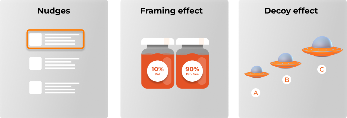
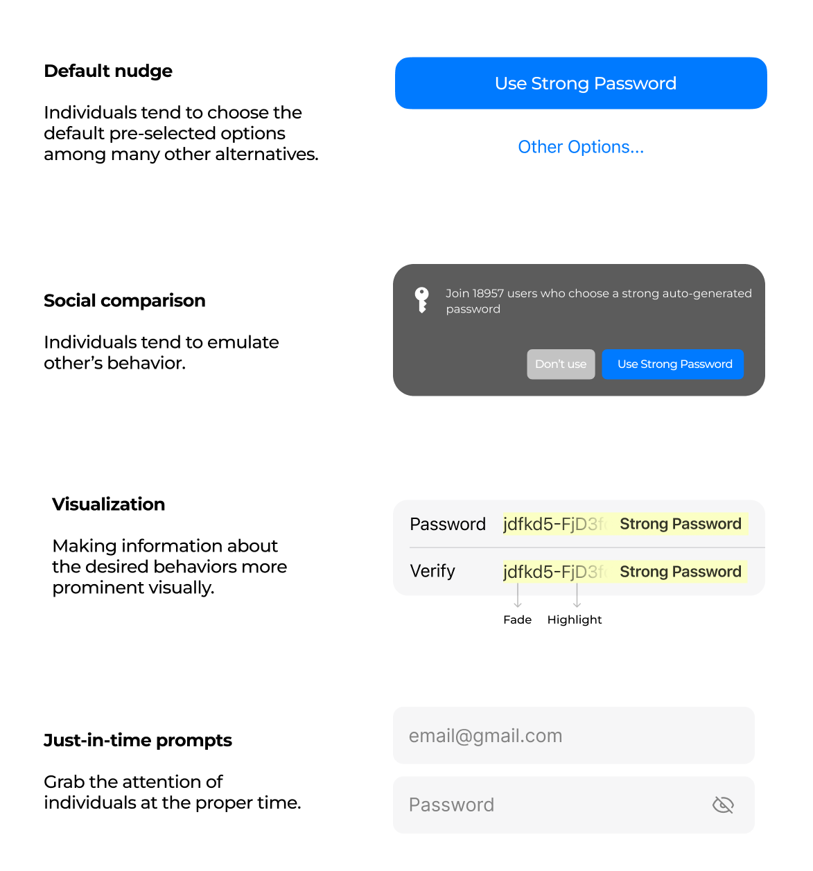
Nudges
Nudges became prominent in UX/UI design thanks to the Harvard and University of Chicago professors Cass Sunstein and Richard Thaler. The two define nudging as gently steering users toward particular actions while maintaining their freedom of choice. See the following example of a real-world nudge:
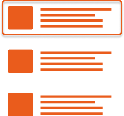

In software UX/UI, you can think of nudges as the opposites of popups. Popups obstruct other UI elements, disrupting the user flow, whereas nudges add visual or interactive cues without interfering with user actions. Some well-known software UX/UI examples of nudges include:
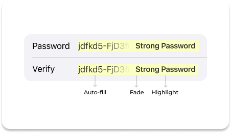
Case study: Randomly generated passwords
Randomly generated passwords In a recent study of UX/UI nudges, 862 participants were recorded while interacting with a password manager application. The application UX included a nudge by suggesting safe randomly generated passwords (RGP) as a default pre-filled option. This option has been chosen by 83.1% of study participants, proving its effectiveness.
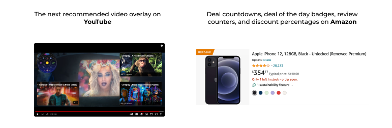
Nudges in UX design: more examples
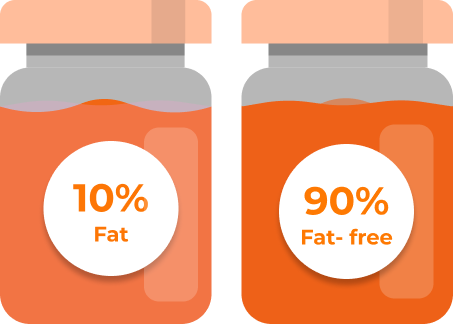
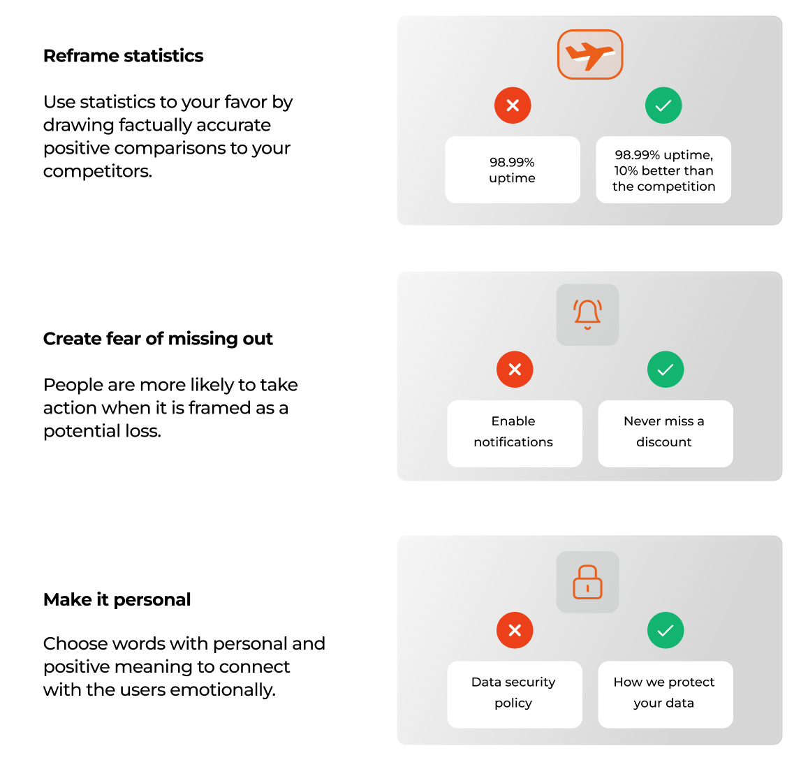
Framing effect
Imagine browsing a food delivery app and finding a new category with healthy options. As a user, would you be more likely to tap on “Healthy food” or “Healthy & nutritious meals”? The difference between the two options is what defines the framing effect.
To a great extent, first impressions, opinions, and decisions are formed subconsciously. By framing information in a particular manner, we can influence how the users feel about it. The framing effect deals with how presenting the same facts in different ways can produce different UX outcomes. The case study below illustrates that even UX professionals are subject to this
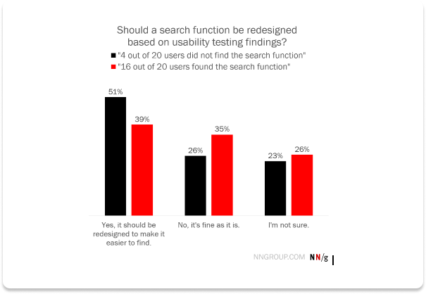
Case study:
In a Nielsen Norman Group survey involving 1,037 UX practitioners, the participants were tasked with evaluating a website search function UI. The participants were divided into two groups and presented with the following framing of the same fact:
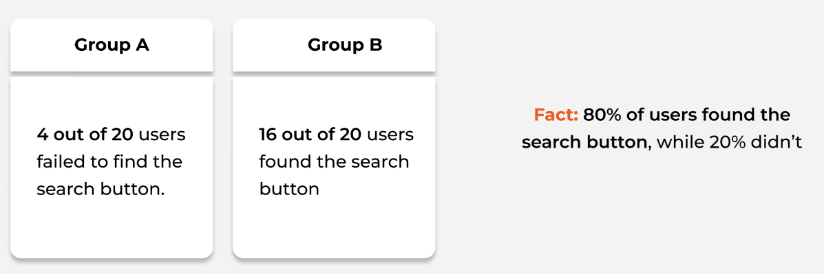
The simple change in framing had a significant impact on the results: the Group 1 participants were 31% more convinced that the search button needed a redesign.
Framing effect in UX design: more examples
Decoy effect
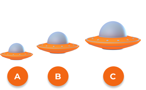
Introducing a new option when choosing between products often makes us reconsider our choices. Consider the following example:
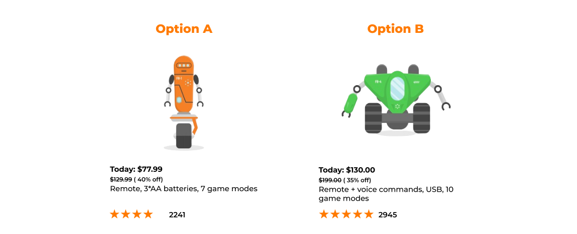
For e-shoppers, the choice between Options A and B essentially boils down to deciding if the extra features are worth the price difference. Once we introduce Option C, the nature of the decision changes:
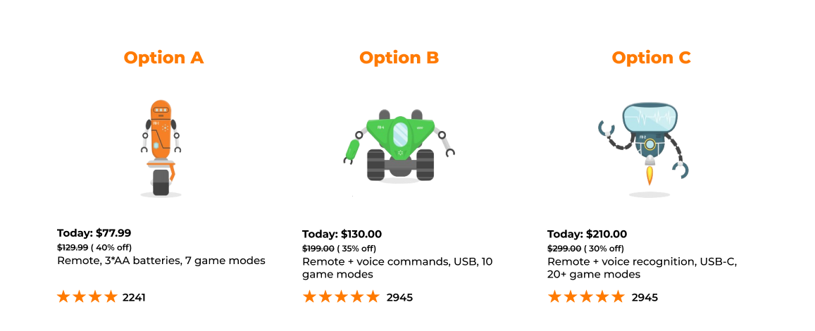
Option C is outside the buyer’s price range, but it makes the least expensive Option A look inferior. As a result, the buyer is more comfortable choosing Option B, which was the more costly of the two in the initial comparison. In this example, Option C is a decoy, and the psychological mechanism at play here is the decoy effect. Let’s look at a real-world example to dive deeper into how it works.
Case study:
The subscription model of the British newspaper The Economist originally included two options: online-only, priced at $59, and online and print, costing $125. The online-only option outperformed the alternative significantly, so the newspaper added a decoy: a $125 print-only subscription. With the decoy in place, the online and print options demonstrated a 43% sales growth.
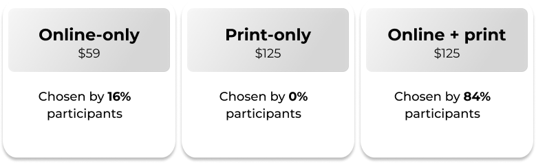
Similar results have been replicated in an MIT study where the participants were initially shown three options:
With the decoy removed, the online-plus-print option became less popular than the online-only subscription:
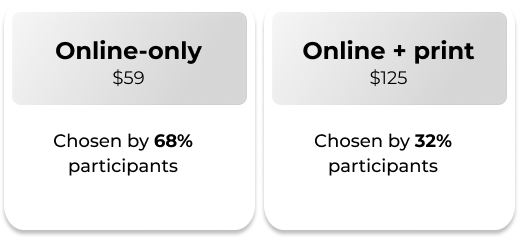
This drastic shift in preference clearly shows the influence of the decoy effect on buying behaviors.
Closing thoughts
Addressing the common UX challenges related to conversions requires an approach that goes beyond conventional strategies. While simplifying processes, eliminating distractions, and incorporating social proof are commonly applied solutions, they may not always yield the desired results in terms of the impact on the end-users’ decision-making.
In recent years, the clients of AgileEngine Design Studio have shown a growing interest in integrating behavioral science principles into UX/UI design. Recognizing that UX revolves around people, our Studio emphasizes the importance of understanding the behavioral principles underlying decision-making. In our experience, leveraging these principles has shown a measurable positive impact on business metrics like conversations and user engagement.