


This is a guest article from Lontia Nkhuwa. Nkhuwa is a product support lead and technical writer. She's the leader of PyLadies Lusaka — a support network for women in the world of Python. Lontia is passionate about creating content that educates, grows, and inspires leaders. In her spare time, Lontia enjoys thrifting and traveling.
There’s a wide variety of visual tools for data analytics and AI on the market these days. They can be used for practically everything — from pipeline setups to data manipulation, model generation, and more. These visual tools for data science allow you to interact with your data and analytics in a point-and-click way to quickly visualize data using graphics, charts, tables, plots, or animations, making it easier to perform data analysis. In addition to visualization, they can help with data access and ingestion, data preparation, DataOps, and sharing your analysis and findings with stakeholders.
Despite how useful they are, many data experts still frown at the use of visual data tools — often a byproduct of myths about the effectiveness of how a user can interact with visual tools. However, they’re invaluable for helping with data transformations, their configurations, and the resulting outputs in a form that you — and others — can better interpret.
Developing many aspects of a sophisticated data project is time-consuming regardless of your coding ability. Visual data tools drastically decrease the time needed to construct prototypes and implement changes, allowing you the freedom needed for proper experimentation. Visual tools aren’t a replacement for code — they’re an enhancement like any language, framework, or library.
And because visual data tools typically don’t require coding knowledge, they’re a great asset for any organization with users of varying technical skill sets, as they enable non-coding analysts and data professionals to further tackle advanced analyses in a self-service manner.
This article debunks six myths about visual data setups and shows how visual data science tools can help you achieve your data goals.
1. Visual Tools Mean Less Control
Many data experts feel that visual tools give them less control over the process than crafting custom code. In actuality, visual tools abstract away the tedious aspects of manually coding data transformation and analyses, so you can focus instead on the accuracy and logic of the processes and whether the outcomes serve the larger business objectives.
Many visual data tools have incorporated the most common options users need into their visual interfaces so that they don’t have to sacrifice control over their analyses for speed. They can have both. Dataiku’s mature platform, for example, takes it one step further, allowing users to define custom expressions using a spreadsheet-like formula language or even incorporate custom code steps directly into the workflow in a variety of popular programming languages like Python, R, and SQL.
2. Visual Tools Are for People Who Can't Code
Visual data tools aren’t only built for people who don’t code. Graphical user interfaces are for anyone who wants to get more done quickly, whether working in code or with low- to no-code. The point is to focus on the desired outcomes rather than the complex steps necessary to get there.
For example, data scientists can write scripts to extract information from different data sources like web pages, clean the data, and convert it into a readable and correct format for accurate analysis. However, this doesn’t mean it’s better than using visual tools to perform the same steps within a good amount of time. Visual tools simply extend the opportunities for data experts.
Additionally, because the workflow and resulting artifacts are more interpretable, visual tools encourage citizen developers to draw upon the business function during development and partner up with domain experts to build processes that can create value.
Dataiku’s visual data prep recipes are all code-based behind the scenes, enabling you to prepare your data as if you were writing the code manually — but without all the hassle. And, for times when only custom coding will suffice, that’s easily accomplished via code recipes without breaking stride or switching tools.
3. Machine Learning Is Too Complex for Visual Tools
Machine learning (ML) is a rapidly developing area in many industries.
Modern data science platforms such as Dataiku offer advanced AutoML capabilities which reduce repetitive tasks, speed model experimentation and evaluation cycles, and help data scientists explain and interpret results. These AutoML processes can help with everything from feature selection and engineering to model training and hyperparameter search to calculating performance metrics and running head-to-head model tournaments, empowering data experts to build and compare multiple models using a fraction of the time and resources.
4. Visual Tools Aren't Realistic for Large Projects
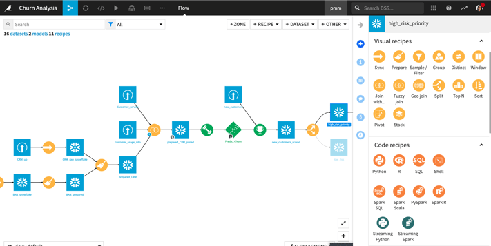
You can think of visual data science tools as an advanced IDE, abstracting away layers of complexity and providing time-saving features without changing the core of the work being performed. And visual pipelines help you better perform and document the manipulations and transformations of your data. When working on large analytics projects, these tools can help you maintain a clear visual narrative so teams can quickly understand the data’s journey from start to finish.
Dataiku has been used on many large projects at leading global companies. The time saved by the reusable visual components and self-documenting frameworks has enabled many organizations to reach their goals sooner and seamlessly maintain the work in production.
5. Visual Tools Are Challenging to Automate
Visual tools allow for the same automation as any other approach, except now you can see what’s happening. This is particularly useful when you have extensive pipelines that could benefit from automation of tasks such as data sourcing and preparation, building models, provisioning compute resources, or updating a pipeline that generates reports or a dashboard.
Many data practitioners aren’t experts in code-based automation, deployment, or MLOps, and therefore never reach maximum efficiency by automating routine data work. With Dataiku, experts can programmatically automate using APIs and the tooling they like best, but everyone else can take advantage of scenarios, a no-code built-in scheduler, to flexibly automate any number of tasks.
6. Visual Tools Are Difficult to Collaborate On
Although developers commonly rely heavily on frameworks like Git for sharing assets and code versioning, visual tools are better for project collaboration if you have teams with diverse backgrounds and technical skill sets.
These platforms allow more team members to work on a project — including those without a deep technical understanding. Everyone on the team can see code-based or non-code-based elements and transparently follow what’s happening to data as it moves through the pipeline.
Dataiku uses Git to manage project changes and versions behind the scenes, and developers can easily connect to remote Git repositories when developing code libraries, plugins, and more. However, non-technical team members will appreciate the easy-to-follow workflow visually represented on the Flow, as well as collaboration features such as project descriptions, wikis, and a built-in chat function.
Drive Business Value With Visual Tools
Visual tools can help you better understand your business value — whether that’s your current successes or areas of improvement. The right visual tools can make you more productive and work more efficiently, meaning you can spend more time on what you do best.
With visual tools, you can avoid hand-coding commodities, saving you time and eliminating the need to perform repetitive, morale-draining coding tasks. Additionally, visual tools make your work more explainable to more people.
The six myths outlined here are simply that: myths. Visual tools can help you understand, explore, and refine your data in valuable and lucrative ways. They also save you time. Visual tools aren’t holding you back; they’re here to propel you forward. Dataiku’s visual capabilities make it easy to do more with your data. With Dataiku, you can perform exploratory data analysis, deliver advanced (yet approachable) analytics, and more.