Color Theory for Designers – A Crash Course (with Infographic)
Color: It’s stunningly beautiful and maddeningly deceptive. Use this color theory field guide (with an infographic) to make lightning-quick color choices with unwavering confidence.

Color: It’s stunningly beautiful and maddeningly deceptive. Use this color theory field guide (with an infographic) to make lightning-quick color choices with unwavering confidence.

Micah helps businesses craft meaningful engagement through branding, illustration, and design.
As a professional designer, you probably don’t need to be convinced that color has a profound impact on digital products and the people that use them. But if you find yourself wishing that you better understood the nuances of color and how to harness its vast potential, you’re not alone.
Using color well is a difficult skill to master. Creating harmonious color schemes and successfully implementing them in design work can be quite a challenge. Why is that?
Does color proficiency spring from some innate ability that only a few possess? Is there a color sense, like sight or smell, that some simply don’t have?
Perhaps, but it’s more likely that the difficulty designers experience with color stems from one unavoidable truth: Color is packed with properties, and each property has a wide range of possibilities.
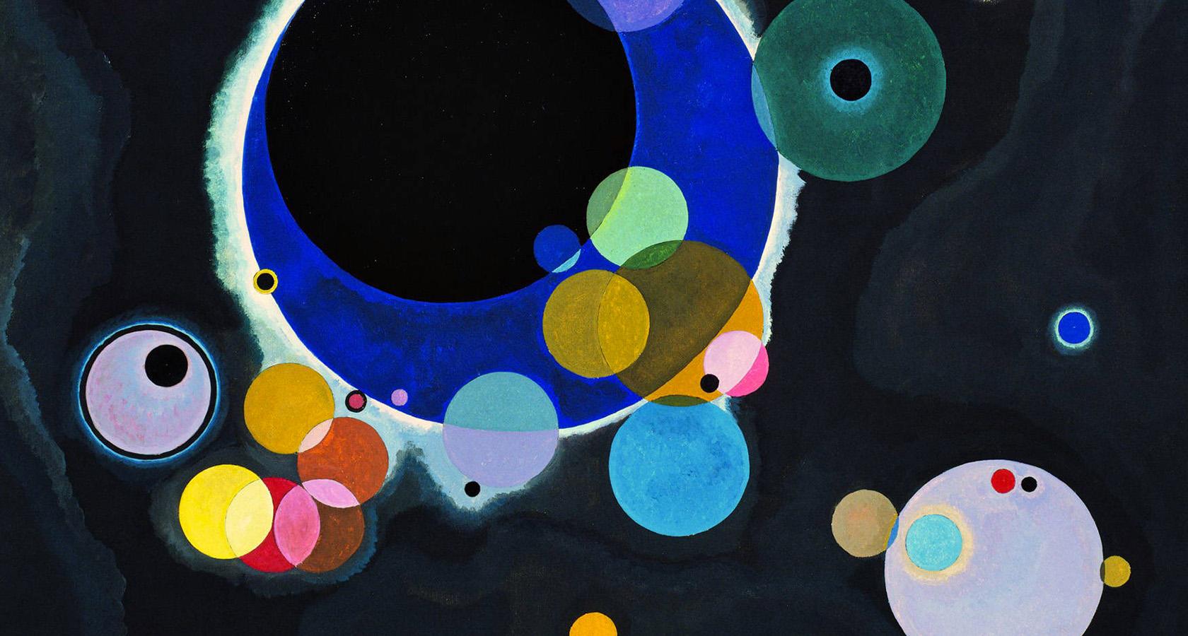
To further complicate things, no color exists in isolation. There are always surrounding colors and light conditions to compete with.
The variable nature of color is simultaneously the source of its communicative power and its maddening complexity. If one color in a scheme changes, it can throw the whole thing out of whack—and wreak havoc on a designer’s color confidence.
This is especially true for designers of digital products, who must consider both the aesthetic outcomes and the experiential impact of their color choices.
Thankfully, mastery of color in UI and UX design isn’t dependent on guesswork, blind luck, or some intrinsic realization of what colors work well together. Instead, using color successfully depends on understanding repeatable rules, principles, and techniques that can be practiced and improved upon.
And while it’s true that the study of color is an immense undertaking, there are practical takeaways that can drastically improve a designer’s understanding and use of color in day to day design work.
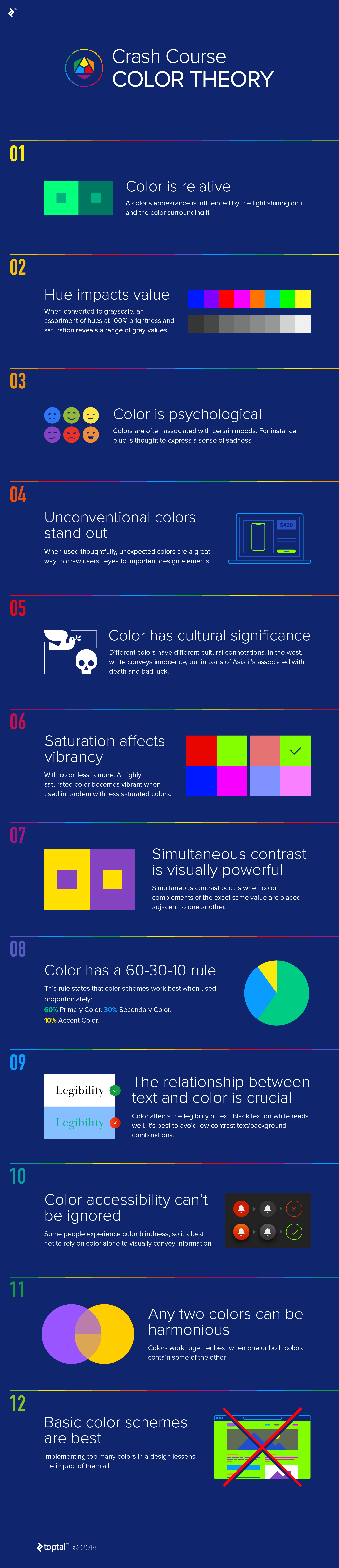
This infographic is a field guide for lightning-quick color choices made with confidence—read it, print it, tape it to your wall, and refer back whenever color questions arise.
Further Reading on the Toptal Blog:
Understanding the basics
How does color affect us?
From color psychology to color and culture, the effect that color has on humans is profound. Different color combinations can impact our purchasing decisions while certain color hues evoke intense emotional responses. It’s these reasons that make color theory for designers so important.
What are color harmonies?
There are colors that, when paired, are understood to make aesthetically pleasing combinations (or color harmonies). Using a tool called a color wheel, designers can create harmonious color schemes to use in their work. Color hue, brightness, and saturation all impact the effectiveness of color harmonies.
What is the psychology of color?
Color psychology is the study of how color affects human emotions and decisions. It is not an exact science because colors have different meanings in different contexts and cultures. For instance, in some parts of the world, white conveys innocence, but in other parts, it signals mourning and death.
What is contrast in color?
Contrast is the visual difference between two colors. The best way to see contrast is to place one color on top of another. If the colors are high contrast, it will be easy to distinguish one from the other. If they are low contrast, they will appear to blend together. Contrast is crucial to color accessibility.
What does color theory mean?
In art and design, color theory is a collection of guidelines that outline best practices for using color in an aesthetically pleasing way. Additionally, color theory examines the how and why of color relationships (color relativity) and the influence of light on color.
Tags
Micah Bowers
Vancouver, WA, United States
Member since January 3, 2016
About the author
Micah helps businesses craft meaningful engagement through branding, illustration, and design.