Visual Electric launches an AI-powered image generator with a designer workflow focus
TechCrunch
DECEMBER 5, 2023
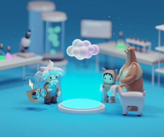
Visual Electric, a company backed by Sequoia Capital, has launched its generative AI-based image-generation tool aimed at designers.

 visualization
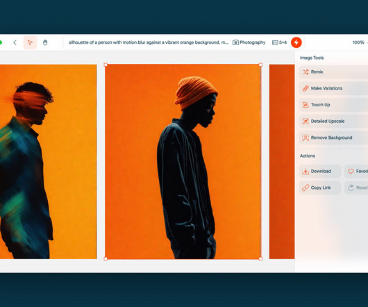
TechCrunch
DECEMBER 5, 2023
Visual Electric, a company backed by Sequoia Capital, has launched its generative AI-based image-generation tool aimed at designers.
TechCrunch
JANUARY 18, 2023
Founded by Ece Kural and Furkan Bayraktar, Scrintal is a visual note-taking and collaboration tool. “We’re creating a new category in work tools; a visual knowledge base. Scrintal raises $1 million for its visual collaboration tool by Haje Jan Kamps originally published on TechCrunch.
This site is protected by reCAPTCHA and the Google Privacy Policy and Terms of Service apply.

TechCrunch
DECEMBER 7, 2022
Pixyle AI’s neural networks train its visual AI algorithms to not only identify fashion items in an image, but also categorize them by attribute, like color or pattern, that match the keywords shoppers use when searching for an item. Other companies that have developed visual AI-powered product discovery tools include Syte , Visenze , Vue.AI
TechCrunch
AUGUST 31, 2022
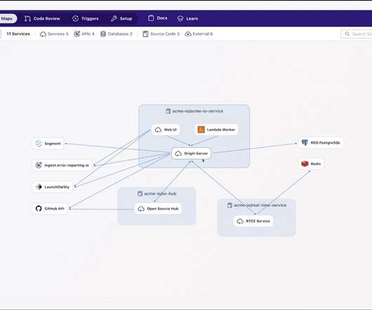
The initial product was designed to help visualize code in open source projects, and company co-founder and CEO Shanea Leven reports the community around the open source project has grown to more than 10,000 members. Companies were hungry for a way to visualize how the the various micro services in a code base interact. “We
Advertisement
Think your customers will pay more for data visualizations in your application? But today, dashboards and visualizations have become table stakes. Five years ago they may have. Discover which features will differentiate your application and maximize the ROI of your embedded analytics. Brought to you by Logi Analytics.
TechCrunch
MARCH 14, 2023
OpenAI has introduced the world to its latest powerful AI model, GPT-4 , and refreshingly the first thing they partnered up on with its new capabilities is helping people with visual impairments. You can read more about GPT-4 here.

TechCrunch
DECEMBER 8, 2022
based startup developing a “smart cane” for visually-impaired people, today announced it has raised £2 million ($2.4 Visual aid. WeWalk raises cash to bring computer vision to smart cane for visually-impaired people by Paul Sawers originally published on TechCrunch. WeWalk , a U.K.-based

Advertisement
Think your customers will pay more for data visualizations in your application? But today, dashboards and visualizations have become commonplace. Which analytics features are replacing visualizations as “the next big thing”. Five years ago they may have. You’ll learn: The 3 benefits of deeply embedding BI.

Advertisement
Think your customers will pay more for data visualizations in your application? But today, dashboards and visualizations have become table stakes. Five years ago, they may have. Turning analytics into a source of revenue means integrating advanced features in unique, hard-to-steal ways.

Advertisement
Many organizations today are unlocking the power of their data by using graph databases to feed downstream analytics, enahance visualizations, and more. Critical graph visualizations with overly complex nodes and connections transform into network graphs that are much easier and faster for analysts to understand.
Advertisement
That’s one of the many reasons we wrote The Definitive Guide to Dashboard Design—to help you avoid common pitfalls, including… Cramming too much onto one screen and expecting the user to figure out what’s interesting and relevant on their own Getting carried away with fonts and colors so the user is distracted by formatting instead of focusing on the (..)

Speaker: Robert Starmer, Cloud Advisor, Founding Partner at Kumulus Technologies
Trace Data - Visualizing application traces to understand application interactions. This session will cover: Service Mesh - managing distributed systems communications for continuous delivery environments. Istio - Service mesh with added benefits. January 31 2019 11.00 AM PST, 2.00 PM EST, 7.00
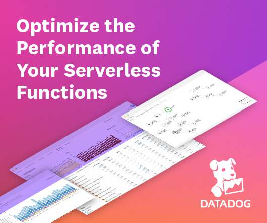
Advertiser: Datadog
In this new product brief from Datadog, you’ll learn how Datadog Serverless Monitoring enables you to visualize your services and their dependencies, gain actionable insights into how the performance of your serverless applications impacts your customers, and tips to monitor the health of your applications in a serverless environment.

Speaker: John Mecke, Managing Director of DevelopmentCorporate, Jon Gatrell, Principal Partner at Market Driven Business
Executives, Board Members, and Customer economic buyers see the world through numbers and visualizations. In this webinar you will learn: How product managers can distill market facts from the market and express them in relevant numerical and visual contexts. Specific techniques for analyzing SaaS products.

Speaker: Dr. Joe Perez, Chief Technology Officer at SolonTek and Senior Systems Analyst at NC Dept. of Health & Human Services
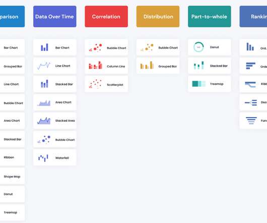
Joe Perez will go over the five "Stages of the Visualization Spectrum" in action while discovering the difference between impact and influence, and how that difference plays into making data actionable. In this webinar, you will learn how to: Identify and recognize the five stages of the visualization spectrum.

Expert insights. Personalized for you.


Let's personalize your content