


As we celebrate Tandem’s 10th birthday this year, we’re taking a look back at the trends and shifts that have shaped our industry since 2011. From the growth of mobile apps to the growing importance of accessible interfaces, the last ten years have brought significant innovation. We reflected on 10 years of change in the coding world earlier this year, and now we’re turning our focus to the field of product design.
The Increased Need for Data Visualization
Before the 21st century, data visualization, or the graphic representation of information, was seldom marketed for personal use. In 1981, the Xerox Star made its debut, complete with the first commercial Graphical User Interface (GUI), capable of turning a table of information into a graphic. However, Xerox Star’s data visualization capabilities were marketed towards business users for client use, not for consumer-facing use.
In the last ten years, people have become increasingly interested in quantifying their daily activities. Consumer culture has shifted to value transparency from the products they use, which has also created an increased need for data visualization. Designing personalized data visualization is key to building trust, increasing engagement, and providing the customized experience people have grown to want.
The fitness industry is a prominent example of the rising ubiquity of data visualization. In 2014, Fitbit created a website and mobile app for users to see statistics like their distance walked or calories burned and consumed. Similarly, Apple created concepts like “Closing Your Move Ring” to gamify experiences for Apple Watch users, motivating them to reach their fitness goals and subsequently increasing engagement. People enjoy seeing patterns in their daily life, like how much sleep they average or how many sets of stairs they climb.
Other industries are also hopping on the trend: mattress companies are developing apps that measure sleep habits, and personal finance management apps have visual bill tracking. Spotify also utilizes data visualization with its annual Wrapped event (a yearly favorite of the Tandem team!). Their fun and energetic visualizations let users see how much music they listened to, what genres and artists they listened to the most, and more.
Creating and personalizing data for users is now more important than ever. Data visualization is both an art and a science, which is why technology companies are now investing more in design — specifically, device-agnostic design. Now data visualization is designed for smartwatches, doorbell cameras, virtual assistants, and many other experiences.
The Release & Adoption of Tools like Figma, InVision, and Sketch
Prior to the release of tools like Figma, InVision, and Sketch, there were limited options for product designers to use when designing user interfaces. Many used Adobe Photoshop or Illustrator, which did not have streamlined toolsets focused on design for screens.
In 2010, Sketch was released, disrupting the interface design world. Created specifically for UX and UI design, Sketch was extremely popular for its simple layout, frequent updates, and ecosystem of plugins. However, Sketch was only available for macOS and lacked live collaboration features. Third-party plugins and handoff tools solved these problems, but designers still hungered for a tool that combined everything in one package.
A flurry of product releases followed to meet that need:
- In Tandem’s founding year, 2011, InVision was launched to address product designers’ frustration with the lack of tools available to create a prototype that was a reasonable stand-in for a digital product. With design prototyping abilities that allowed users to see their prototype in a web browser via a password-protected link, InVision was a game-changer.
- By 2013, Marvel had launched as a free prototyping and collaboration tool similar to InVision, allowing users to mimic the behavior of an application to communicate and test ideas.
- 2014 saw the launch of Zeplin, a plugin made for collaboration between designers and developers.
- In 2016, Figma was introduced as a browser-based interface and prototyping tool, making it accessible to anyone. Figma’s live collaboration tool lets designers work seamlessly on a project together in real-time, which proved extremely useful for growing design teams.
- 2016 brought Adobe XD, which carried similar features to Figma.
- And in 2017, InVision launched Studio as a competitor to Adobe.
In a single decade, designers and engineers went from having a few program options to having dozens. As tools like Figma, InVision, and Sketch continue to be created and improved with more functions than ever before, the boundary between designed interactions and code may become more blurred. Figma has begun consolidating features, and we now see new features within InVison and Figma helping designers understand and specify CSS styles for developers. Design tools help facilitate communication between designers, developers, product teams, and clients — which is key to creating impactful software.
The Rise and Fall of the Flat Design Style
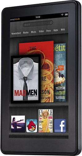
Before Tandem was founded, skeuomorphic design — design that mimics concrete objects’ appearances and interactions — was popular because people needed real-world cues to help them understand the strange terrain of digital interfaces. An example of this is the first generation Kindle Fire, with its three-dimensional bookshelves and wood texture that mirrors the appearance of a real-life bookshelf. However, during Tandem’s ten years in business, flat design has dominated the tech industry.
In 2012, Windows 8 was released, which was one of the first widespread examples of flat design. One year later, Apple introduced iOS 7, cementing the trend of the flat design style. Its launch was incredibly polarizing but tactical because Apple understood that as people became more familiar with digital interfaces — specifically touch interfaces — they needed fewer skeuomorphic cues to know how to use them. An edit button no longer had to look like a “button” for people to know to put their finger on it.
Flat design emerged as a way to create something natively digital rather than reproducing the look of the physical world. Gone were the reflective surfaces, bevels, and drop shadows. Instead, minimalism took over, which felt like the furthest move away from what had been dominating user interface design prior. Flat design helped propel the idea of abandoning rules and properties of the physical world, which was exciting.
Today, the design pendulum is swinging back as we begin to see evidence of humanity in UI work — like shapes and textures inspired by nature and more realistic 3D animations and renderings. Design now reflects the consumer movement of authenticity, with trends going toward more handmade, raw, and honest styles. Many designers in the industry felt that user experience got lost in the oversimplification of UI elements within flat design. However, several principles of flat design are still worth considering when designing for screens, like clear type hierarchy, clear visual hierarchy, and functionality.
The Democratization of Typography
The art of typography dates back thousands of years and saw dramatic changes during the latter half of the twentieth century. In 1961, IBM launched the Selectric typewriter, which had an “element” or “type ball” that was easily changeable so people could use different fonts in the same document on the same typewriter. In 1984 Apple’s Macintosh computer debuted, enabling designers to create typefaces digitally with graphic design software. This software considerably sped up the typeface design process and lowered development costs.
While the Macintosh democratized typeface design, there was still a barrier to entry for those looking to purchase fonts rather than create them because font libraries were expensive. Everything changed in 2010 when Google launched Google Fonts, which greatly influenced digital typography. By introducing a library of more than 1,000 free and open-source web fonts, Google helped people who weren’t able to afford licenses to libraries of traditional fonts. Google Fonts had excellent timing because responsive web design — design that adapts to different device resolutions, like mobile versus tablet screen sizes — was starting to take off. Now anyone could use high-quality typography for their web and mobile sites.
In the last ten years, responsive web design has become a key component of typography design. In 2010 we saw the launch of the iPad, and just two years later the Pew Research Center reported that 22% of US adults owned a tablet, and of those adults, 64% read the news on their device. With an increasing number of people using tablets and smartphones to get information, designers had to consider typography for different devices.
The last decade of typography has reflected the trend of flat design style, made evident by neo-grotesque fonts like Helvetica becoming popular. Because people often read text on small screens, the last decade has also seen an increase in corpus size, or the height of a lowercase x in a given typeface, which provides better legibility when using small fonts. The challenges of designing typography for responsive web design have created new opportunities to design typefaces focused on legibility and accessibility.
Going forward, accessibility remains top of mind for designers. On mobile devices, native typeface — the font native to the operating system (San Francisco for iOS or Roboto for Android) — enables individuals to scale overall font sizes, regardless of design. Scaling helps those with low vision. However, using native typefaces alone isn’t always enough for brands. The struggle between branded typeface and purely accessible type is something that designers must consider daily. Designing layouts that respond to fluctuations in size is a challenge because it requires less focus on visual appearance and more focus on utility — designers have to find that middle ground.
Type is always important, but using it well in web design is not always easy. Today we are witnessing a backlash against flat design fonts and a rise in modern, quirky serifs. It is now vital to consider larger corpus size, clearer differentiation between similar-looking characters, and better foreground and background contrast when designing accessible typography.
Design Systems
The concept of a design system — a collection of visual style and reusable components with clear standards that help tie products together — has been documented since the 1960s. However, the real turning point for design systems was in the early 2010s, when people and businesses adapted to using technology every day. When Tandem was founded in 2011, the rise of smartphone and tablet usage made it evident that cross-platform design was essential to remaining relevant. Therefore, design systems became more popular as they helped speed up production and prototyping.
As their popularity grew, product design teams found that design systems made it easier to scale and move more efficiently. Instead of reinventing the wheel each time a new component or interaction was needed, the team could look to their design system for reusable components or shared rationale. Moreover, rather than only having a style guide or pattern library, a design system allowed designers to have everything in one place: hero elements, typography, information architecture, and more.
For the user, operating an app built with a cohesive design system and consistent design language will ultimately create a positive experience and build trust. However, while design systems are very efficient in creating that consistency, it is crucial not to create something too rigid. Being overly specific makes it difficult to approach and adapt. Rigidity diminishes creativity! Finding the balance between consistency and creativity is every product designer’s job.
It’s exciting to see a rise in the creation and use of design systems. Companies like InVision have helped make design systems more accessible to smaller companies by introducing tools to create systems that integrate with design software. Design systems are ever-changing, alongside the processes designers use to populate them. Yet, one thing remains constant with design systems: they serve as a source of truth for product teams and businesses as they design, build, and add to their products.
The Rise of Design and its Role in Education
Until 2011, most technology companies had a small staff of designers. However, as smartphone usage gained popularity, the sleek, easy-to-use experience set higher standards for all user interfaces. Technology companies had to keep up with competitors, so they started to ramp up their investment in design. Companies like IBM have gone from a designer to developer ratio of 1:72 to 1:8 in just five years. And in the past ten years, demand for employees with emerging technology and design backgrounds has grown by 250%.
With the rise of design has come the need for more designers. Universities around the world have expanded their programs to meet the demand for both design and technology-related skills. There are so many specialties in the design field, and not all of them concern visual or print design alone. Now, students are learning to be more open about what being a “designer” means — graphic design majors learn how to code, and front-end programmers study design theory and basic usability principles. Design majors and courses now span topics like prototyping, human-computer interaction, 3D design, user experience design, coding, and more.
Design is only becoming increasingly important in our visual-driven world. Companies realize that their most successful competitors have a large portion of their organization dedicated to design. Teams with established design operations collaborate, communicate, and operate more efficiently both internally and externally. With data-driven design operations, teams can track metrics to remove ambiguity between finished and unfinished work. Being able to measure the impact of decisions has helped validate the importance and need for investing in design teams.
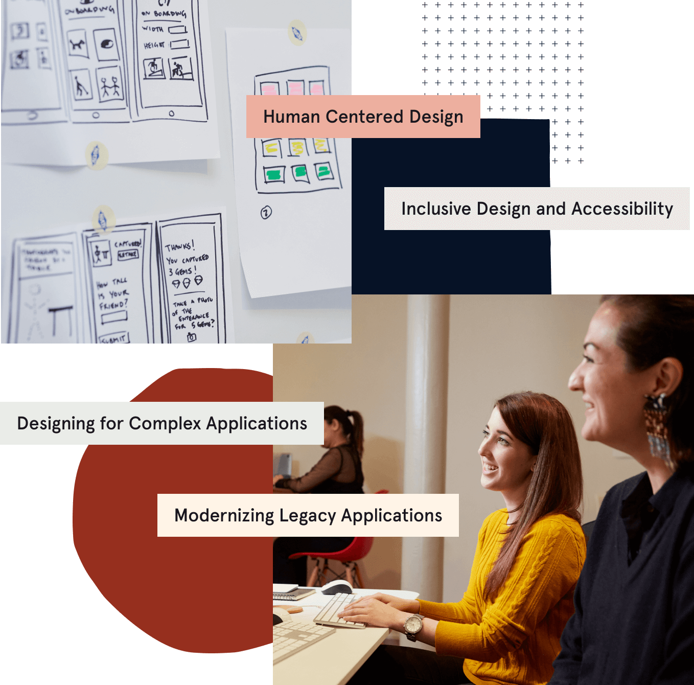
One thing hasn’t changed: We always focus first on people.
While many trends will come and go in our industry, human-centered design will always remain valuable.
As systems become increasingly complex, it is still crucial to put people first. Designing products for everyone is what will spark lasting change in the decades to come. We want to improve accessibility and user experience, which ties into our Tandem values of “Rise to the Challenge” and “Ship Quality Work.” When focused on people and aligned by a shared vision, we can create products to reach our long-term goals — and that’s something that’s never going to change.
We are grateful for Tandem’s place in the product design field over the past decade — it’s such an exciting, rapidly changing space. While we have some theories for what the next ten years will hold, we’re humble enough to know that the future inevitably has surprises that will expand far beyond what we thought possible.


